NextDoor Homepage (Android)
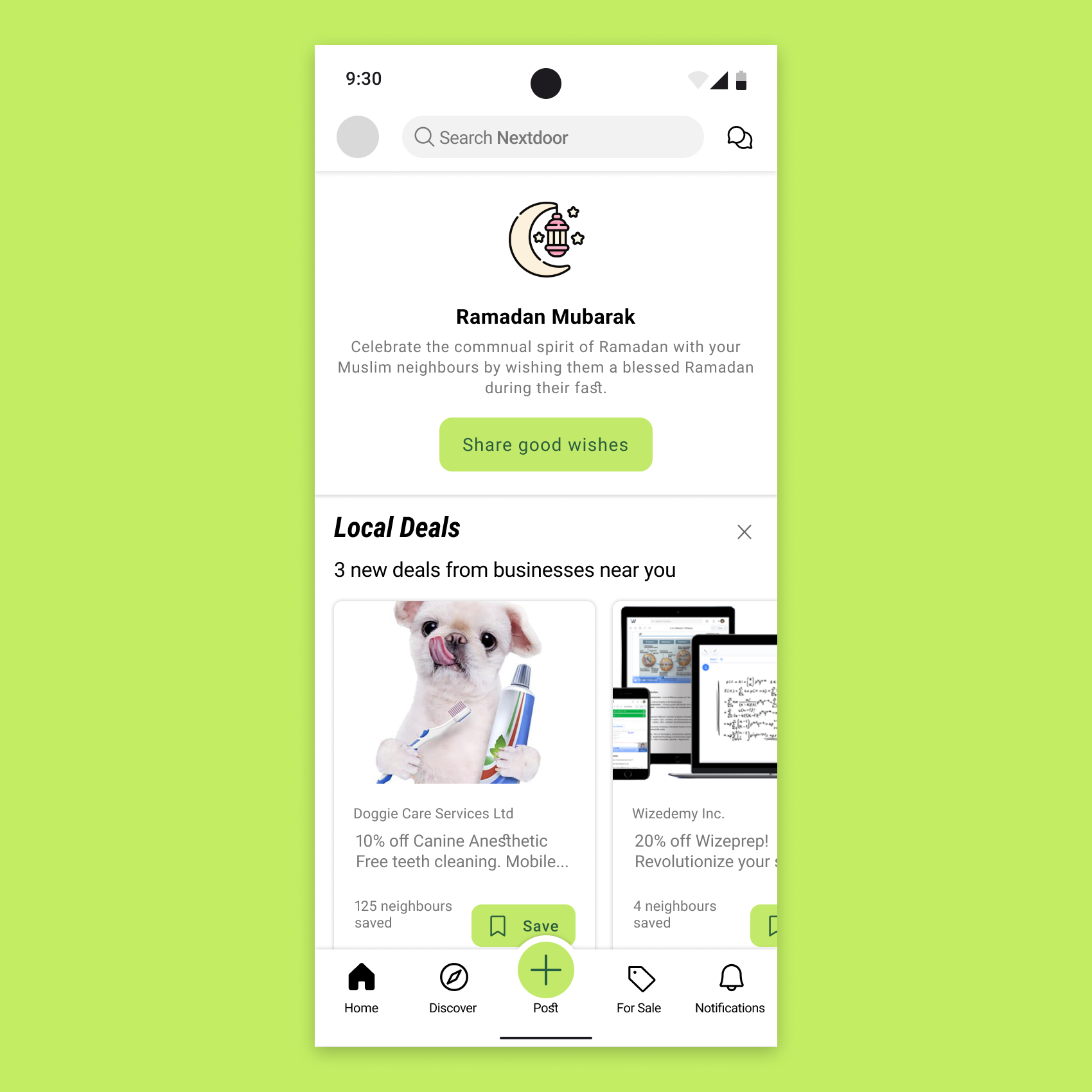
I wanted to do an Android screen, so I picked three screens imitating NextDoor (1,2,3).
- Beyond the status and navigation bars, NextDoor didn’t really draw on any Android or Material 3 patterns. Still, it got me exploring a Material Design kit in Figma, and becoming somewhat more familiar with the names there.
- Font sizes are bit wonky: 12, 14, 16, 22. The card font sizes were actually in-between the font sizes everywhere else: 11 and 13. It made me wonder if the card text sizes were actually 12 and 14, but scaled down using the CSS
scaletransform or something like that.
- Speaking of type: the line-height and kearning needed to be manually adjusted for each font size to match the screenshot. I always see type specified as “size” / “line-height,” but I rarely see kearning adjustments specified? Need to look into this.
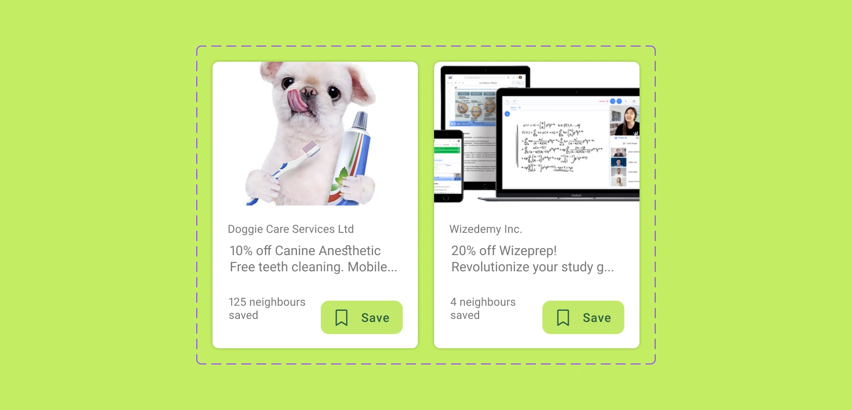
- The icon set was not something I could find. Some of them matched my go-to, Phosphor Icons, really nicely. But some of them had no corollary anywhere I could find, such as the “For Sale” icon with its little drawstring (quite nice, actually).
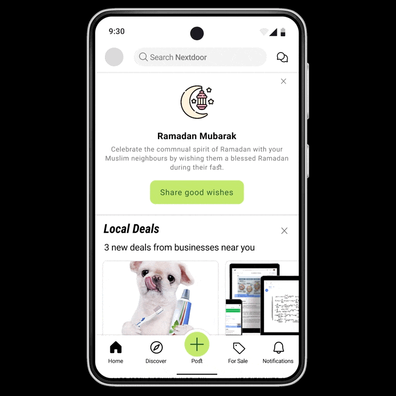
- Had I had a little more time to play with prototyping, I would have liked to try to show how the top “sticky” region shrinks to hide search when you scroll down (i.e. Krisztian Nagy’s solution).