Expedia Sign-in & Form Components
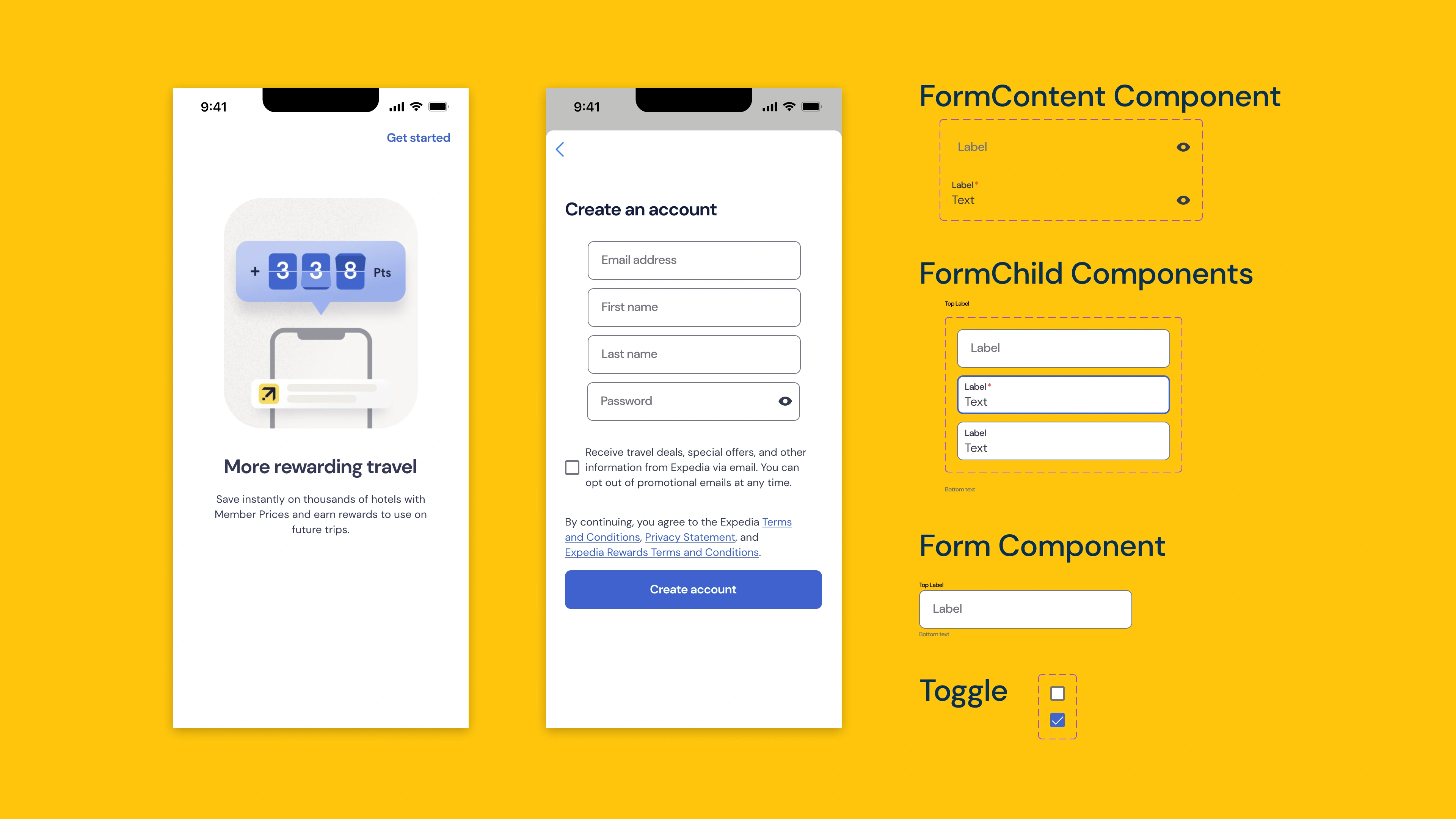
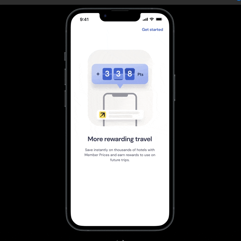
The goal here was pretty simple: recreate a couple of the “Create an Account” screens for Expedia, taking my cue from these screenshots on Mobbin.
- The body font for Expedia’s design is clearly geometric, but I couldn’t find an exact match anywhere. So I opted for DM Sans, a low-contrast geometric sans serif that matched up pretty close.
- The color system was pretty simple. The neutral colors, or “grays,” are all tinted blue (a 234 hue on the HSB/HSL scale), which pulls off a AAA rating against both the slick yellow (I really like their yellow) and white. There are a few interface colors I didn’t recreate here (mainly red and green).
- Taking cues from Mike Ridd’s method of creating form components, and then making those components interactive, I spun up a pretty simple prototype.