Case Studies
Creating a Voice-First Channel for Guided Meditations
Overview
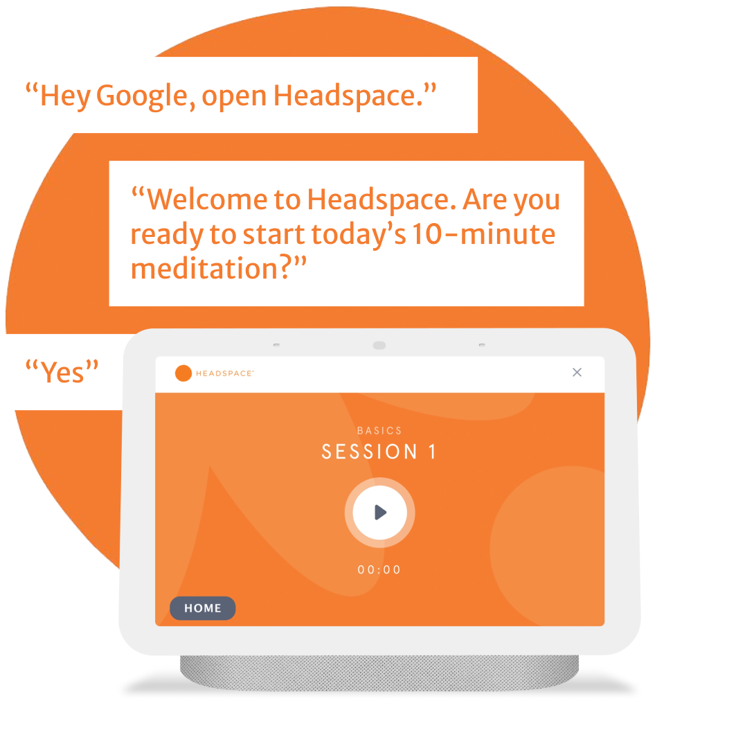
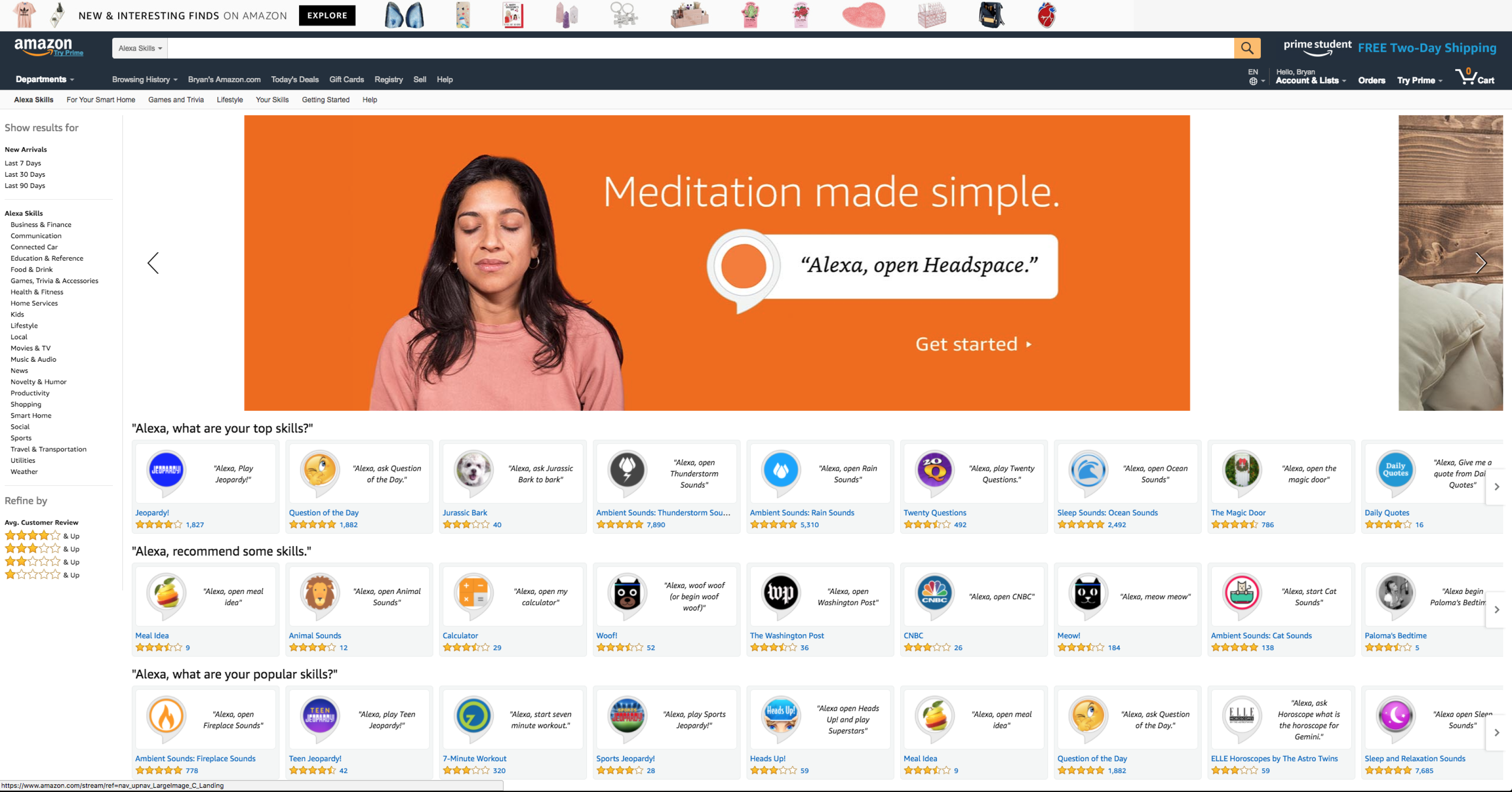
Headspace asked us to build a voice channel for Alexa and Google Assistant, allowing customers to access hundreds of guided meditations without touching their phones.
We were tasked to find ways to make it easy to jump in and start meditating for anyone with a Google or Amazon smart speaker.
Company
RAIN
Client
Headspace
Platform
Multimodal voice UI for Amazon Alexa & Google Assistant
My Responsibilities
- Product Strategy
- Information Architecture
- Content Strategy
- Script and copywriting
- Voice UI / NLU Design
- Visual UI Design
1.7m
Users
12.1m
Sessions
85%
Returning Users
4/5
Avg star rating on Amazon & Google’s Platforms
Initial Discovery
Surveying the Hurdles to Integrating with Headspace's Ecosystem
To begin with, I took a look at their app and website, looking to understand the ecosystem that I would be building the conversational experience within.
In doing this survey, I realized some critical things.
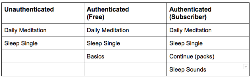
First, Headspace has a variety of users that I would need to plan for when designing our conversational experience. One of the most important was the difference between free users and paying users, because the selection of meditations is so different for each. I realized that I would need to design with three groups in mind:
- Users who hadn’t connected to any account, free or paid
- Users who had connected to a free account
- Users who had connected to a paid account
My challenge here would be two-fold: determining what we should say to each user, and encouraging users to advance from no account, to a free account, and then to a paid account.
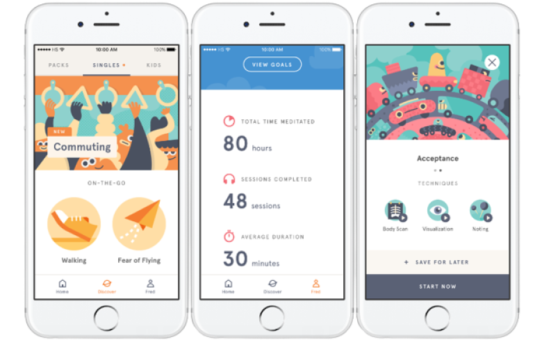
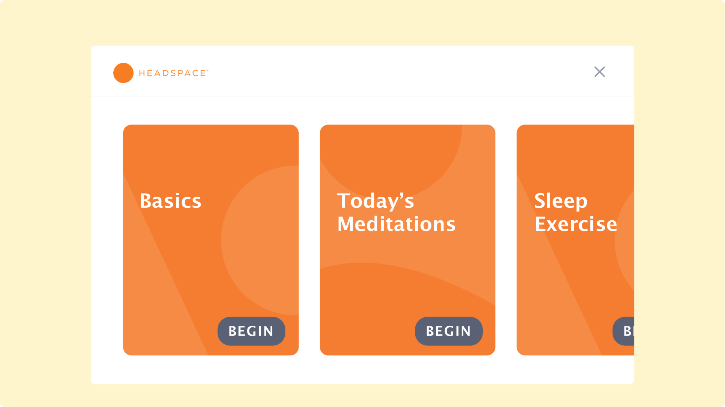
Second, there is a lot of browsing—which is a challenge on voice. Headspace has a variety of meditation “packs,” most of which are themed toward some need: learning the basics of meditation, or topics like focus, patience, pregnancy, or anxiety. On the website and app, which are graphical interfaces, this variety is manageable. There is a robust flow for browsing hundreds of meditations, organized by topic, length, or mood.
But for voice, browsing poses a problem: conversational interfaces are not the best interface for exploring large lists. Would users want to use Headspace to browse this very large library? I made an assumption here, that they would not. (And Headspace was not planning to make their entire library available on voice anyway, a decision out of my hands.)
I hypothesized that on voice, users would want to pick up where they left off on the app or website, or that we might make simple, personalized suggestions about a pack and ask if they wanted to try it.
My challenge here would be to find the best way to help users continue in their pack, or find a new pack quickly.
Initial Designs
Building out initial designs
With these initial plans made, I began writing out user stories and use cases. First, I tried to think through–how would users invoke, or “open,” this experience? And what features would there be?
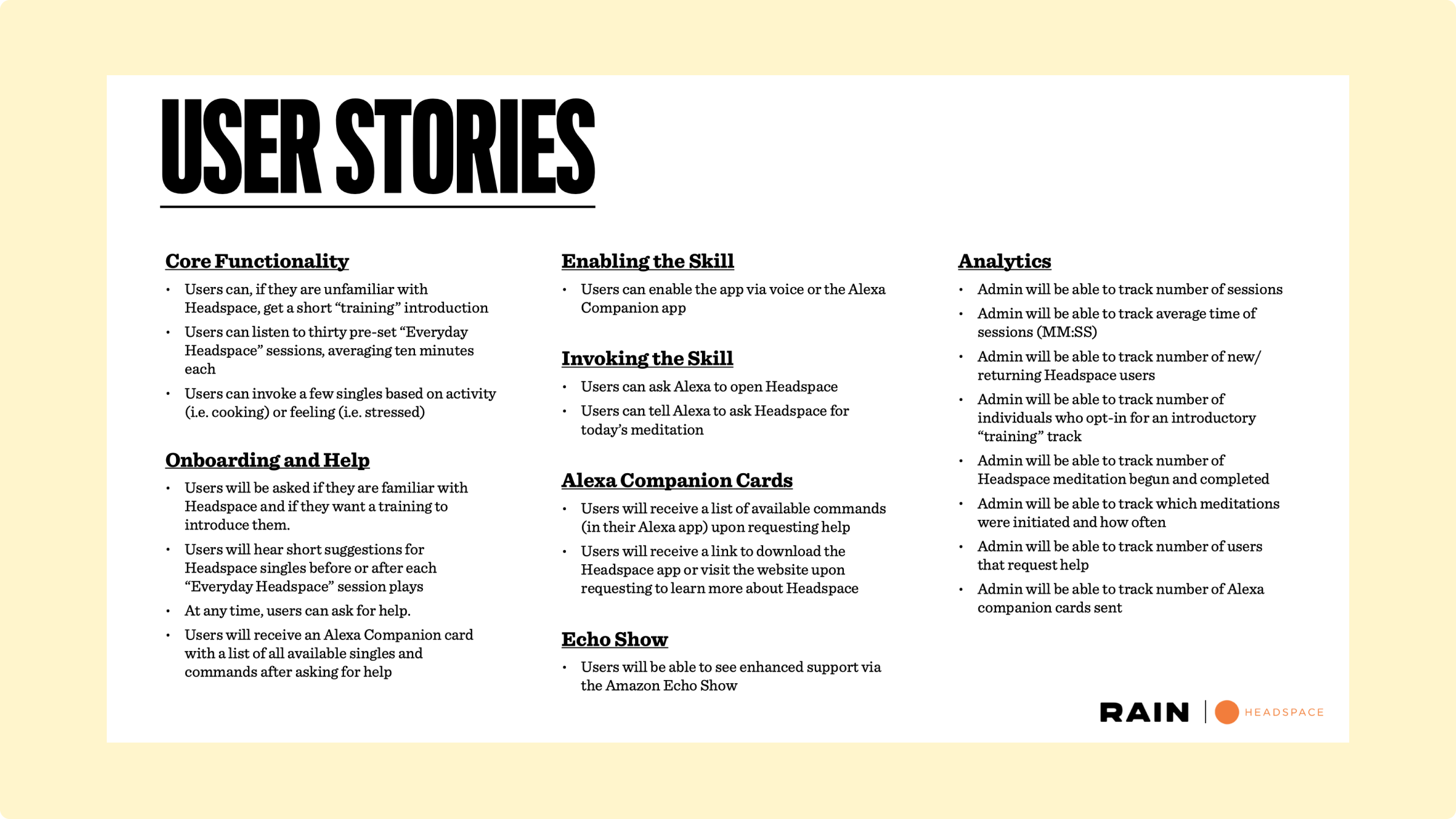
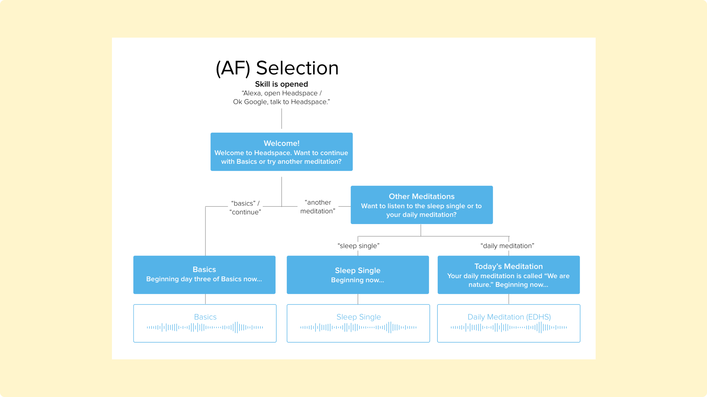
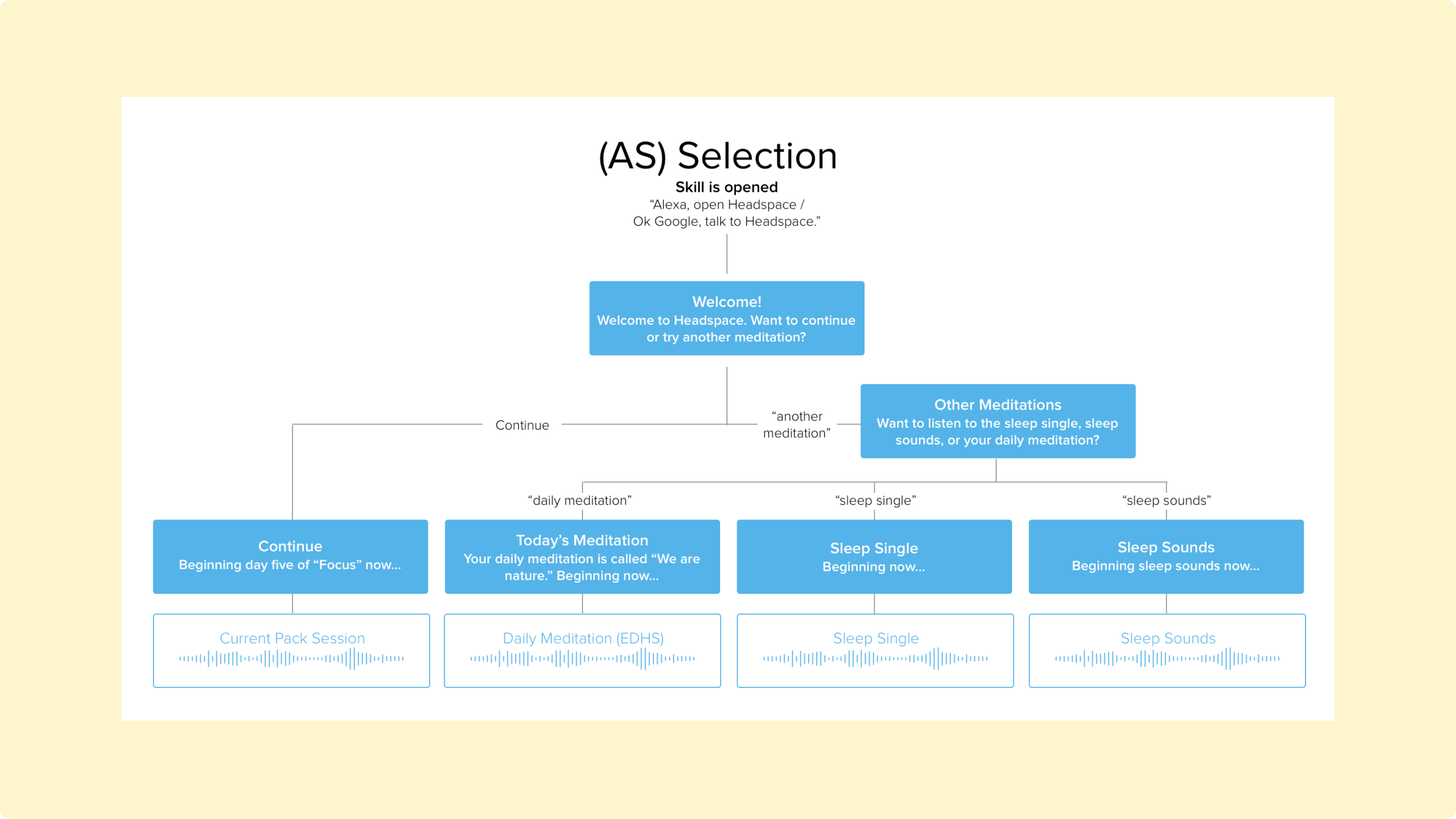
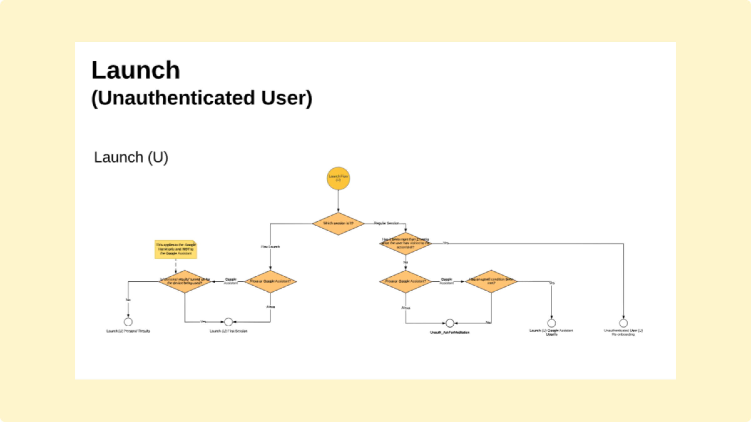
As mentioned above, there were three kinds of users: the “unauthenticated”, using the app without logging in (“U” in the diagrams below); the authenticated with a free account (AF); and the authenticated with a paid account (AS).
From this, I had a firm understand of the ecosystem; the challenges I would face; the features I would need; and the assumptions I was making. I was ready to start scripting, and testing those scripts with real people.
Designing TTS Prompts
The first challenge was finding ways to be brief, especially with so much to say up front
The initial design for prompt zero—the very first thing anyone would hear—went something like this, in the voice of Andy:
Hi! Alexa here. Just a quick note before we begin: I strongly encourage you to connect to your Headspace account, whether you have signed up for free or are a subscriber. If you don’t have an account, it’s easy to make one. Connecting allows you more access to meditations. Would you like to learn more, skip, or take a moment to connect your account?
The audio file was nice, as it added Andy’s voice, but in addition to everything else we were trying to do, just too long at over forty seconds. It was a far cry from passing Amazon’s one breath test. So I tried the following:
Welcome to Headspace, guided meditation for everybody. Do you want to learn more about connecting your account? Or jump right in?
This was far better. My favorite on-boarding experience is Duolingo, which allows you to jump right in. And this was much closer to that. Still, I had removed the value proposition. So I tried the following:
Welcome to Headspace, guided meditation for everybody. Do you want to enhance your experience by connecting to your Headspace account, or start meditating now?
I felt much better about this. But two problems emerged here, one from my own reasoning and another from user testing. First, there were two many verbs in a single option: want, enhance, connect. A user might not only be overwhelmed, but may not even know what “enhance” means. Second, from user testing, I discovered that some people wanted an option to “create” an account, and were confused about whether “connect” required an existing an account.
Welcome to Headspace. Meditation has been shown to help people stress less, focus more and be happier. Headspace is meditation made simple. And by creating an account, you can get access to even more meditations. (Short Pause) You can create a new account, connect an existing account, or start meditating now. What would you like to do?
This tested far better. Another improvement here was that I was able to make the choice more definitive. Instead of asking “Would you like this or this?” I asked “You can do x, y, and z. Which would you like?” This helps users better understand the question, and it did make a difference.
Designing TTS Prompts
The second big challenge was to think about how to provide affordances—guidance on how the conversation would go
This was really importance because I wasn’t letting the user, any of the possible users, to access any of the packs. Especially users who hadn’t logged in, since if I were Headspace, I would want users to connect their accounts–even free ones–ASAP. So I settled on the following available meditations.
My first scripts were alright. For example, for subscribed users, consider:
Would you like to try today’s meditation, the sleep single, your current pack, or sleep sounds?
Once I started scripting, I realized pretty fast that I wanted to encourage users to a particular meditation in each case. For example, I’d want to encourage unauthenticated users to try the daily meditation; authenticated users to finish the Basics pack; and authenticates users to continue whatever “pack” they were on. (Most packs, by the way, usually consist of ten to thirty individual “sessions”—each its own meditation.)
So I tried the following for a subscribed user:
Would you like to continue your pack, or try another meditation?
If the user asked for another meditation, then I could say “Would you like to try the sleep single, sleep sounds, or today’s meditation?” I liked this, and it tested well with real users.
As I went along, I realized two additional things. First, some parts of the app provided context. For example, the name of the pack each user is in, or the name of the daily meditation (which changes regularly; the “theme” is conveyed in the title, and is part of the appeal). Second, some of the terms didn’t sound great when spoken. For example, “sleep single” doesn’t make as much sense outside of the visual hierarchies that the app and website provide–especially if the user has never logged in. So the scripts began to look more like this example, for subscribed users:
It looks like you’re in the middle of the “Focus” pack. You can continue, or try another meditation. Which would you like?
If the user asked for another meditation:
Sure thing! Today’s meditation is called “We are nature.” You can try today’s meditation, our guided sleep exercise, or soothing sleep sounds. Which would you like?
Considering Multimodality
How do we display affordances when visual affordances are available?
With some of the voice-first decisions in place, I was ready to start considering visuals. A sizable minority of smart speakers had displays, and Google Assistant was also available as a chat interface. Both smart displays and chat interfaces needed to be considered.
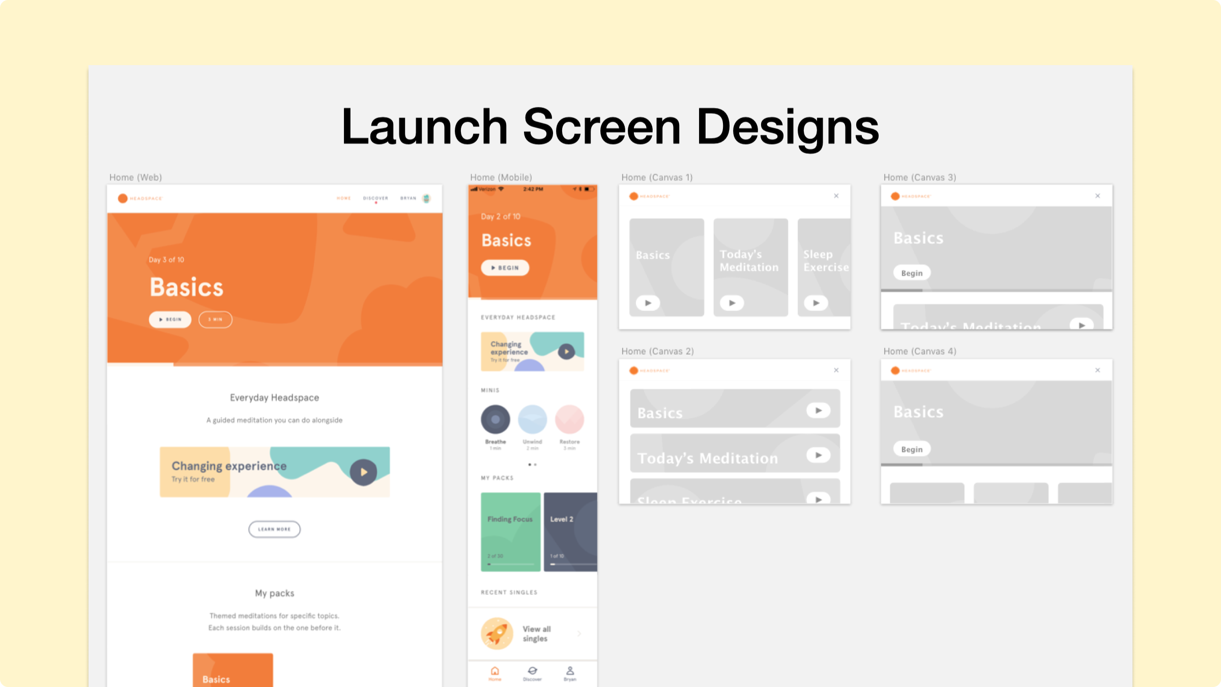
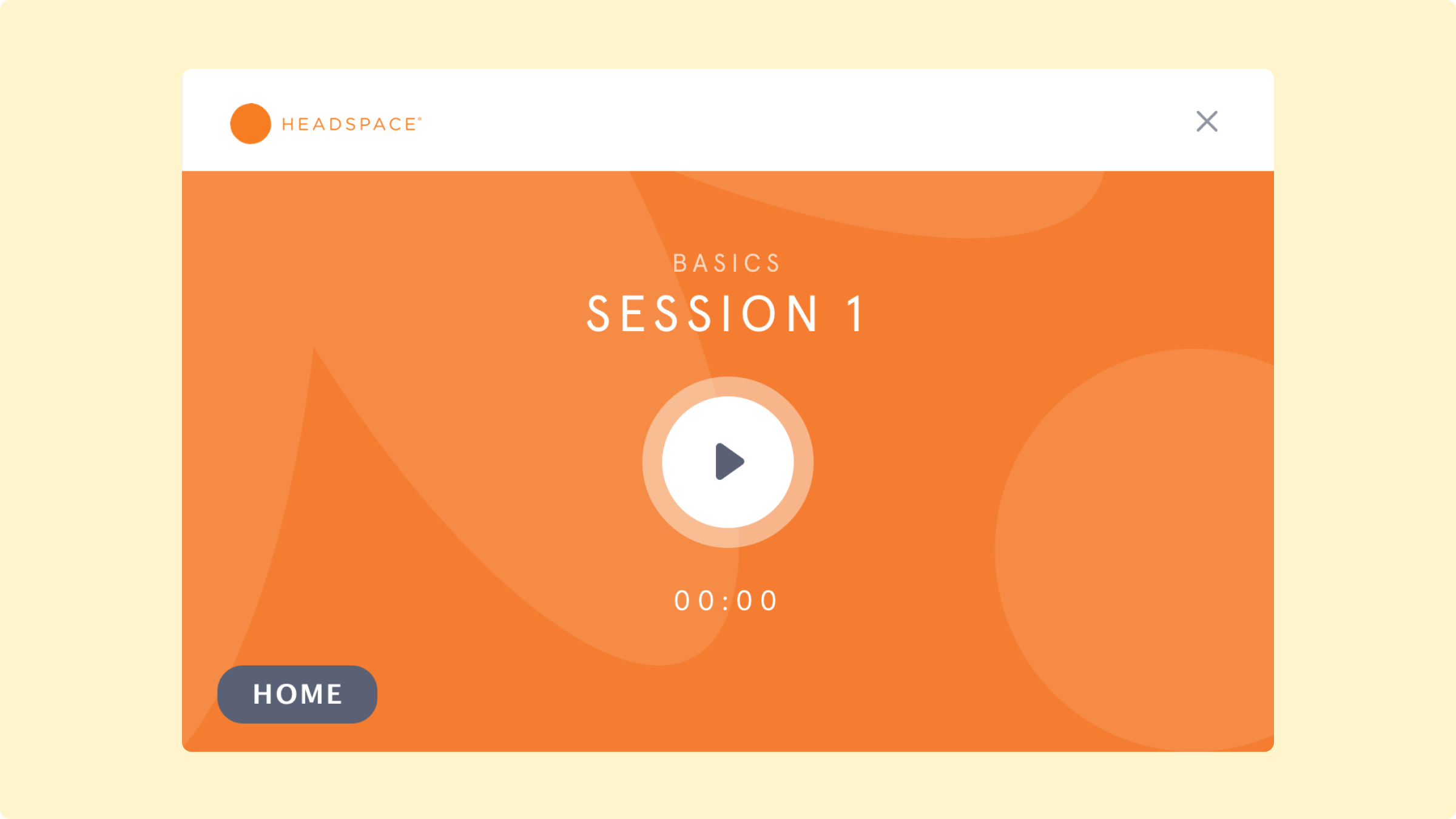
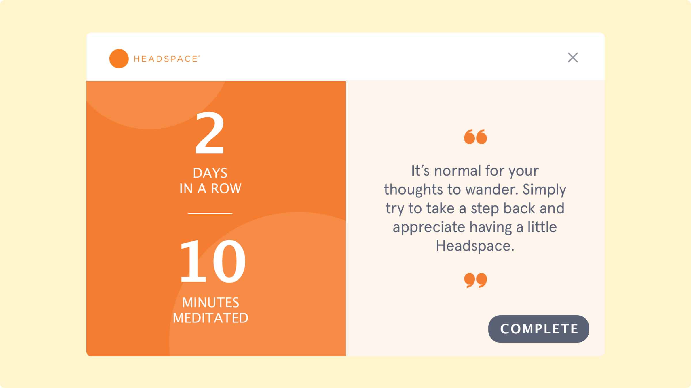
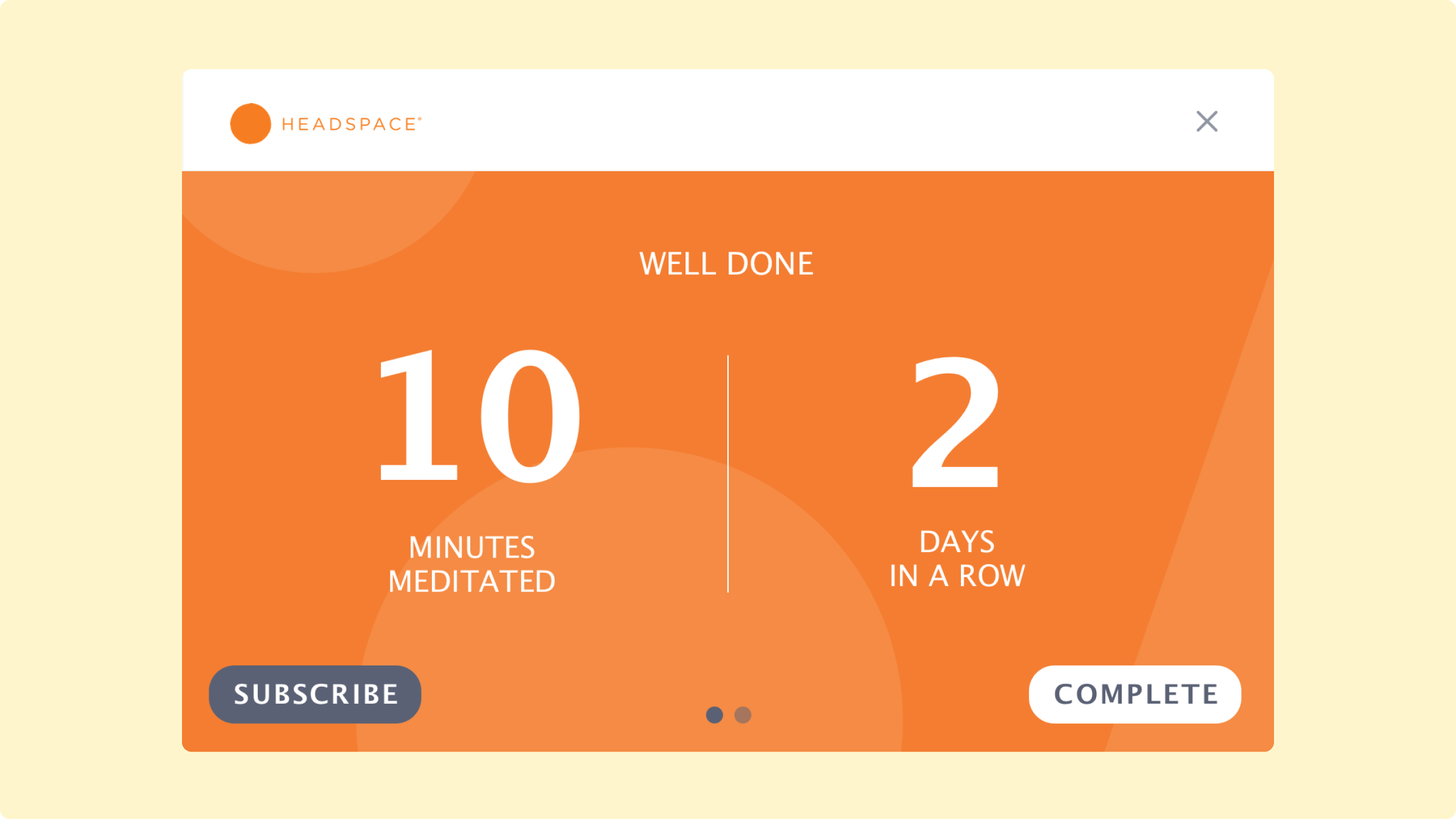
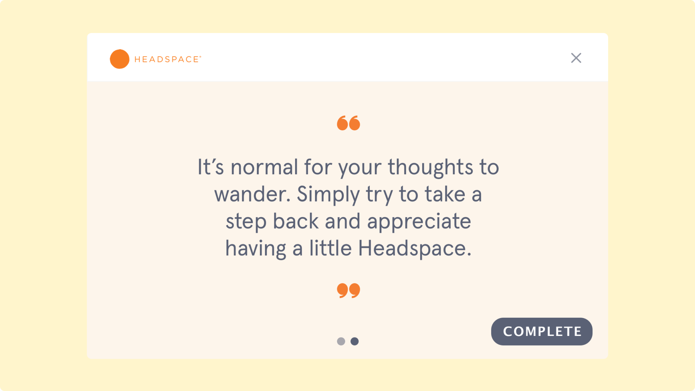
Here are two alternative options we considered for the post-meditation screen.
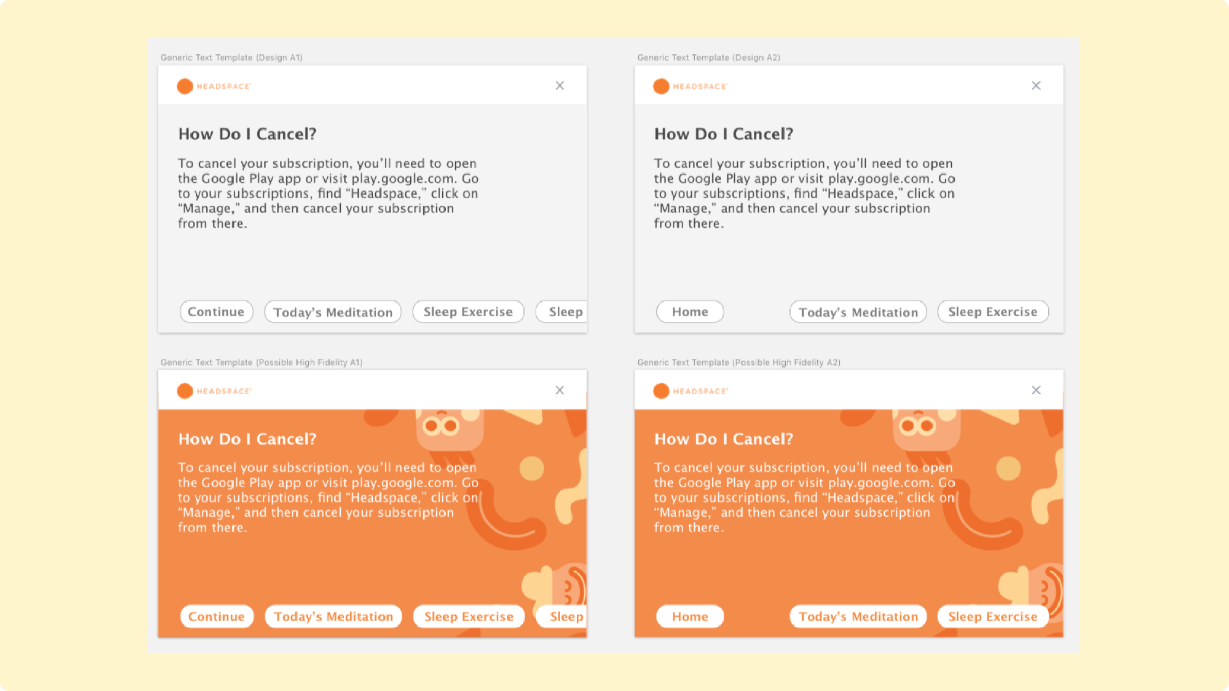
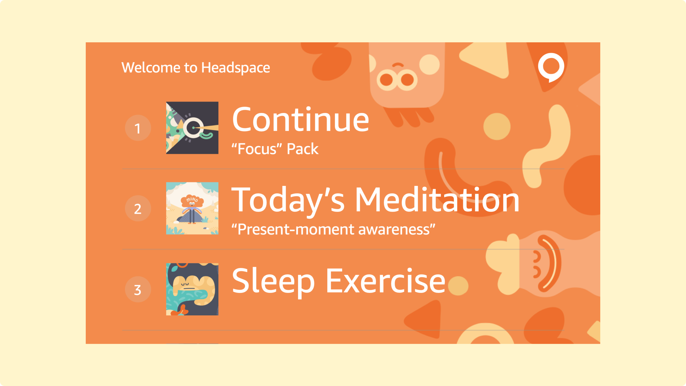
As we iterated, adding new features, we also played with other menu visuals.
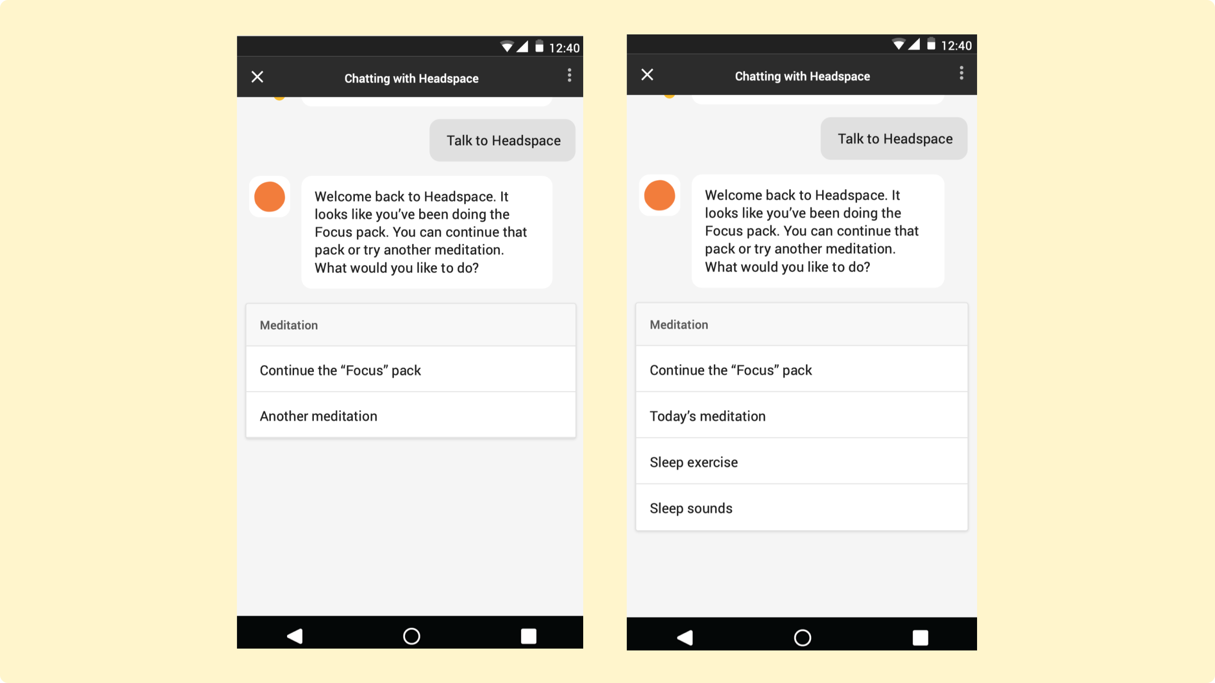
We also made the voice application available on Google Assistant’s chat interface.
Building a Prototype
Buiding a prototype to prepare for evaluative generative testing
To test, I wanted to ask users intelligent questions. I wasn’t trying to explore options, but evaluate how far I had come. There were two main things I looked for:
- How long did it take users to respond to the main prompt?
- Did the titles for each meditation make sense to users, especially those unfamiliar with Headspace’ platform?
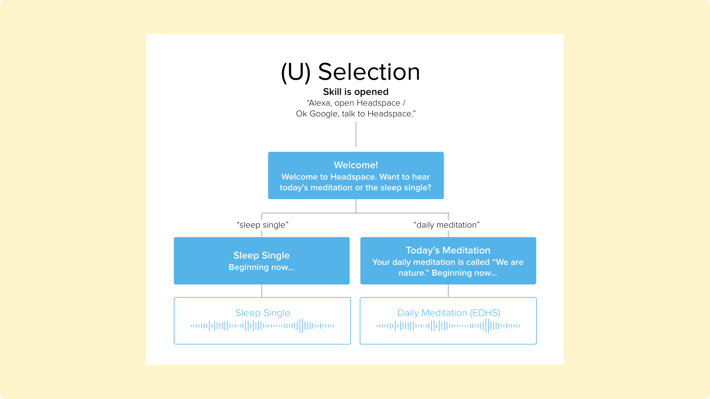
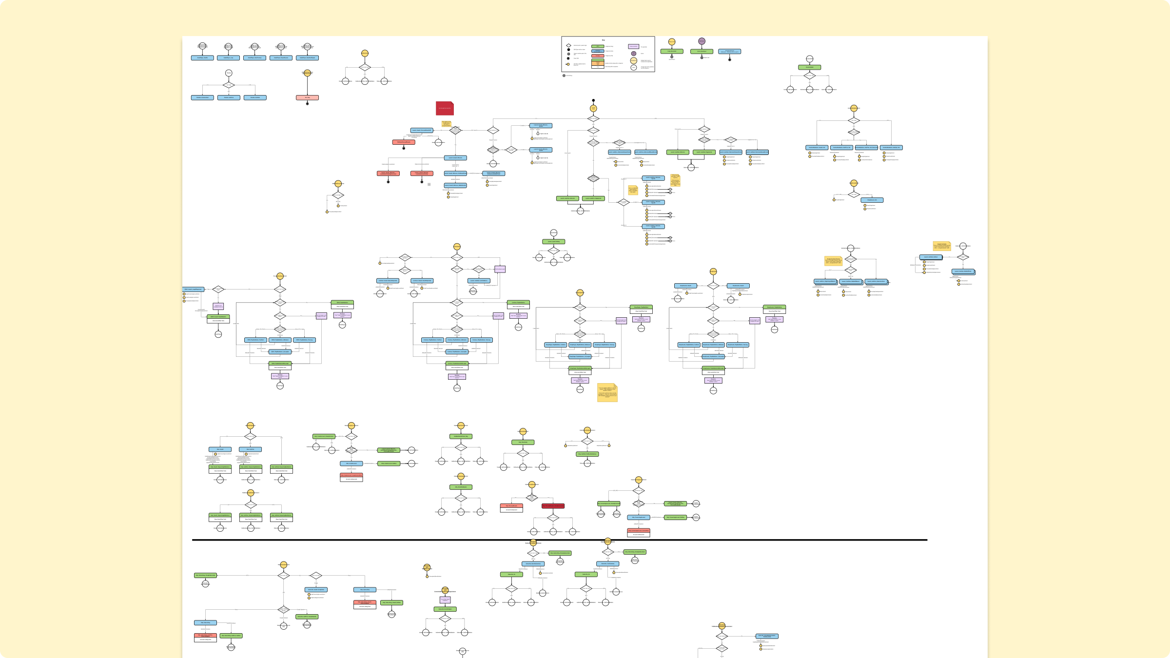
But to do that, we needed to build a working prototype. Working closely with our developer, I constructed a State Machine Diagram–a diagrammatic map of the conversation’s logic, organized around utterances (what was said) and intents (what was meant).
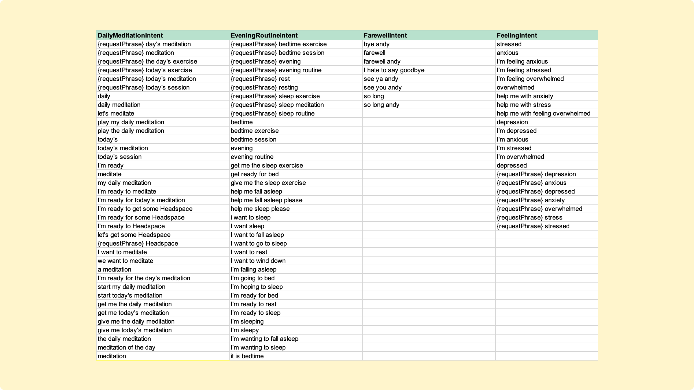
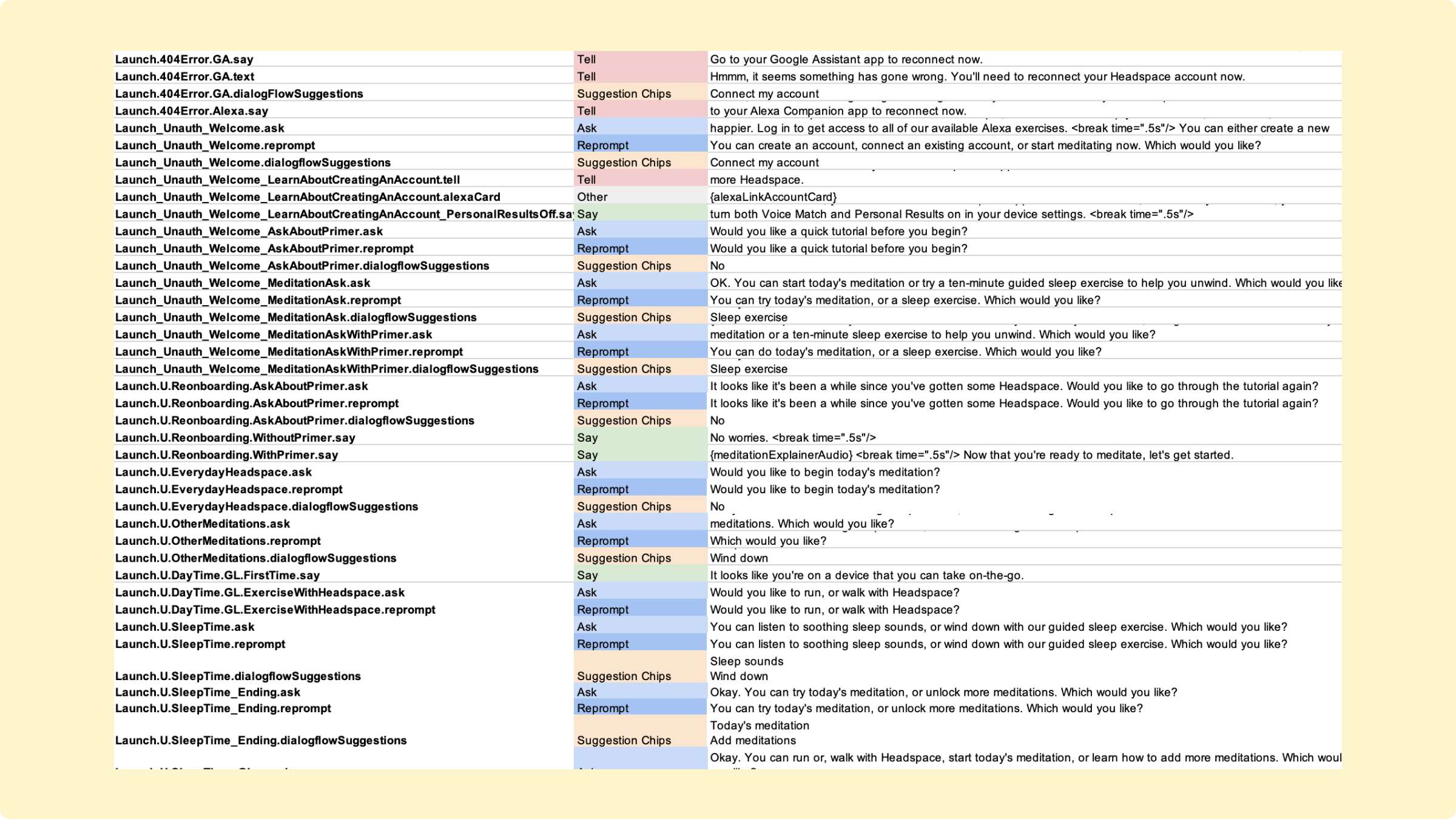
In addition, Rommel and I created the NLU or interaction model—a network of dozens of intents, hundreds of utterances, and hundreds of TTS responses.
Results
What did we learn? And how did the voice application grow and evolve?
We launched the first iteration of the Headspace voice experience in January, 2018, and iterated on it five times, adding or modifying features each time. Since the launch (as of December 2020), the Headspace skill and action have had over 12 million sessions.
1.7m
Users
12.1m
Sessions
85%
Returning Users
4/5
Avg star rating on Amazon & Google’s Platforms
From the experience, and seeing the skill and action out in the wild, we learned some important things.
- Headspace makes a great conversational interface. The idea of being able to play a meditation without using a phone or screen-device was, it turned out, appealing to a lot of people. One Amazon reviewer said they didn’t want to use Headspace when they went to bed, because it meant they needed their phone near them; this changed that. Other reviewers talked similarly about how this helps them in their “digital detox.”
- People accepted the limits on discovery. People adjusted well the idea that only certain meditations were available, even as we continued to expand the flow to allow additional meditations.
- Test, test, test. When the exprience launched, there was a short advert after each meditation free users would hear, encouraging the user to subscribe. People hated this: it would wake users up and ruin the “mood” that each meditation created—and we removed it quickly. Sadly, many of the bad reviews from those early days are still prominently featured on the skill and action’s pages, a problem neither Google or or Amazon have acted to fix. I wish we had caught this in testing, and if I could do it over, I would have worked in more research around the actual experience of listening to the meditation; I spent most of the time focused on selecting a meditation.