Case Studies
Rethinking Prescription Management for US Veterans
Overview
The VA wanted us to explore an accessible, voice-first interface for veterans refilling prescriptions.
Working with the VA, I led UX / UI design on an Amazon Alexa voice app allowing US veterans to order their prescriptions in a safe, secure, and user-friendly experience on their smart speakers.
Company
RAIN
Client
US Department of Veterans Affairs
Platform
Voice / visual UI on Alexa Smart Speakers
My Responsibilities
- Product strategy
- User experience design
- Information architecture
- Conversational UI / NLU design
- Visual wireframes
- Lightweight design system
- Prototyping
- Design research
Results at a Glance
-
Success: Time on Task
Relative to the automated voice system, we reduced time-on-task by nearly 400%
-
Success: Accessibility Improvements
Differently abled users we tested with unanimously expressed pleasure with the experience, saying "I don't see how you could make it any easier” and “How easy is that... If it works like that... God, yeah, please.”
-
Failure: It Never Shipped
Just as we were about to launch, the entire Amazon team working on regulatory medical voice applications was laid off. We could no longer launch on consumer-facing smart speakers.
-
Success: Rewrote Digital Strategy
In spite of that, we built the groundwork for a comprehensive multimodal / conversational UI strategy that the VA could incorporate in building chatbots, IVRs, and multimodality in their mobile apps
Hypothesis
A natural language interface would improve accessibiliy and time-on-task for all users, freeing up pharmacists for more complex tasks
At the outset of the project, veterans could manage their prescriptions through web, mobile, and IVR (interactive voice response) touchpoints.
But the web / mobile experiences suffered from accessibility issues for low-vision users, and the IVR system was cumbersome. So the VA wanted to update their service to allow veterans to order prescriptions using a more natural conversational interface on smart speakers, specifically with Amazon Alexa.
User Research
Understanding our users without direct access to them
The VA is a large, bureaucratic, government agency. For this reason (and an overabundance of caution about veteran safety), we could not access real veterans with real prescription data until late in the game.
Much of my role, therefore, was doing the best within these constraints. Discovery relied on:
- Stakeholder interviews
- SME Interviews
- Previous research done by the VA, including personas
- Audits of the existing web / mobile ecosystem
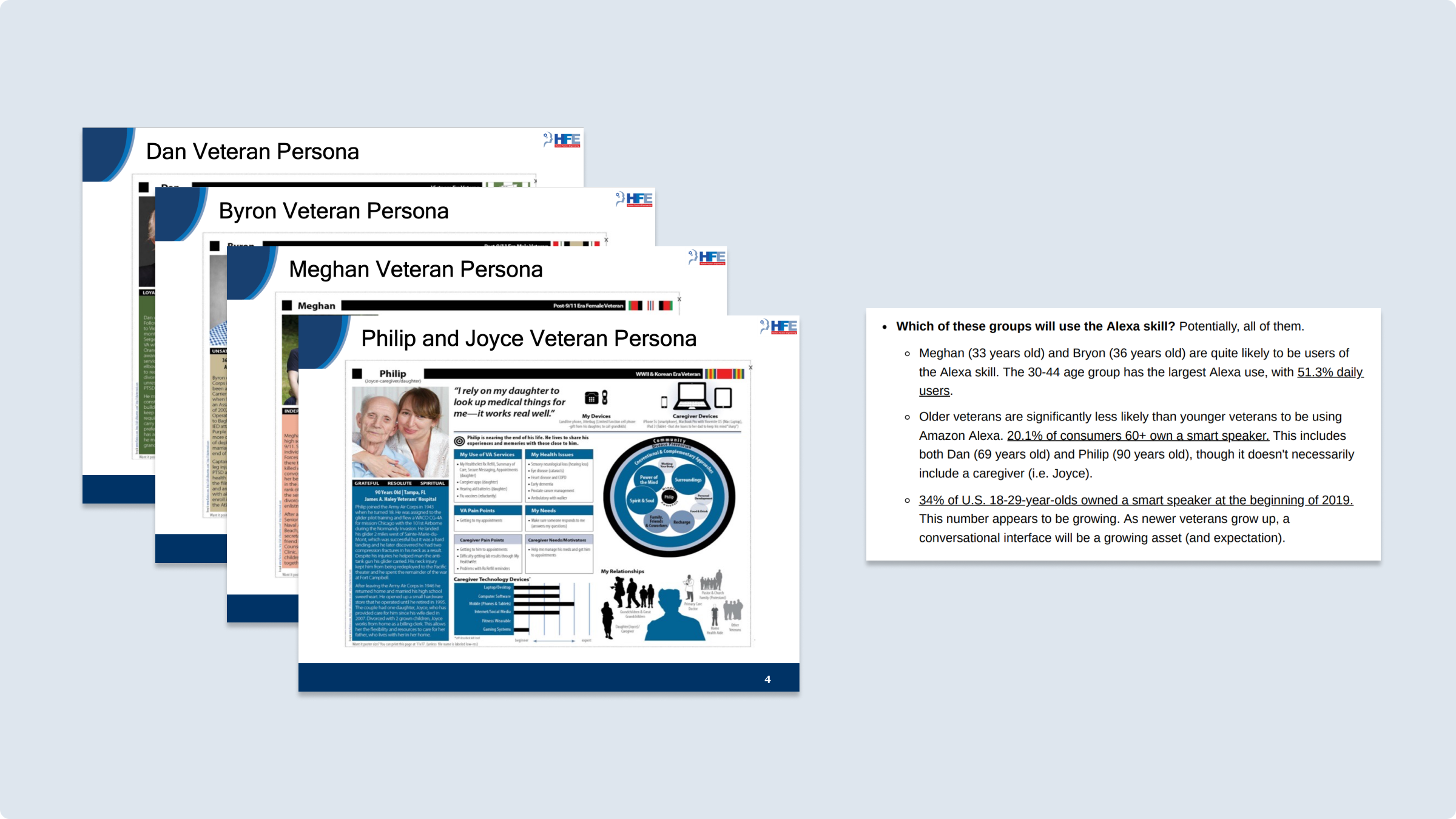
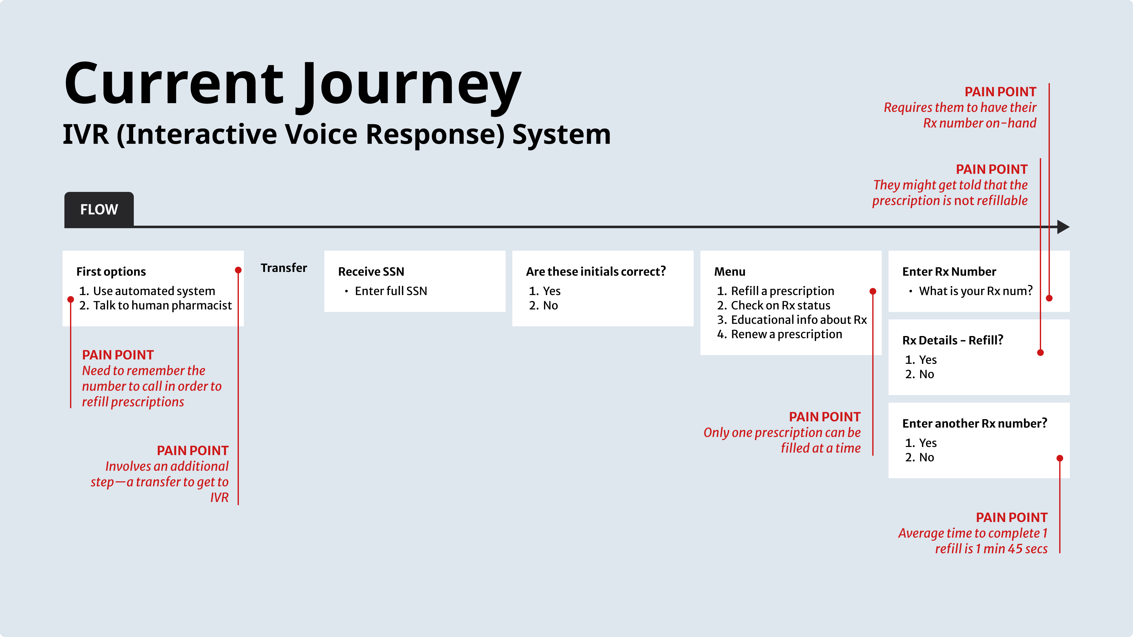
One of the key “existing” services was the IVR—the interactive voice response system that veterans could access by phone. I drew out a journey map of the existing service, highlighting six key pain points.
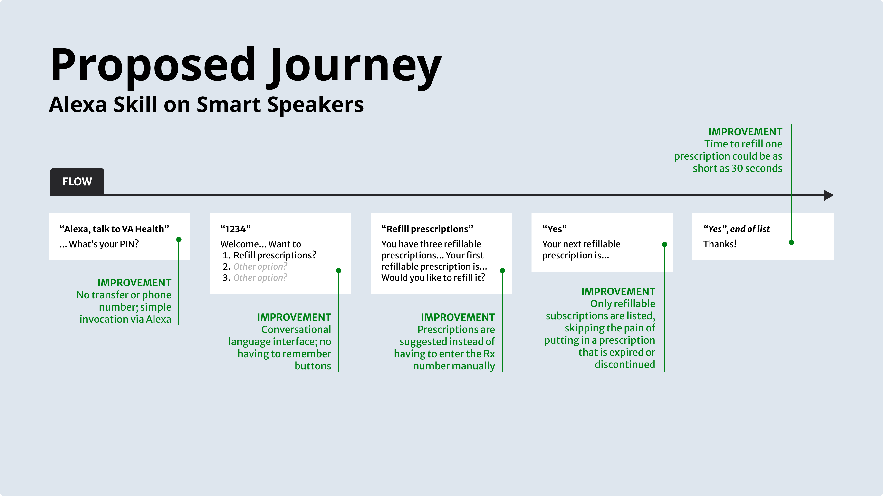
And after drawing this out, began to envision a new flow, outlining how a nex experience could address each of these pain points.
Defining the Scope
Focusing in on basic prescription refills—as well as listing prescriptions and tracking shipments
We now had four things we had to keep in mind.
- Technical constraints of Amazon Alexa
- Technical constraints of the VA’s API
- Practical limitations of a voice-only interface
- Likely expectations of veterans
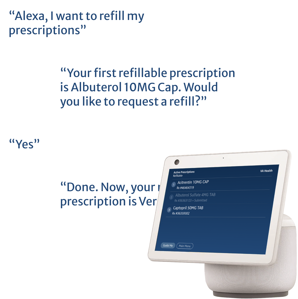
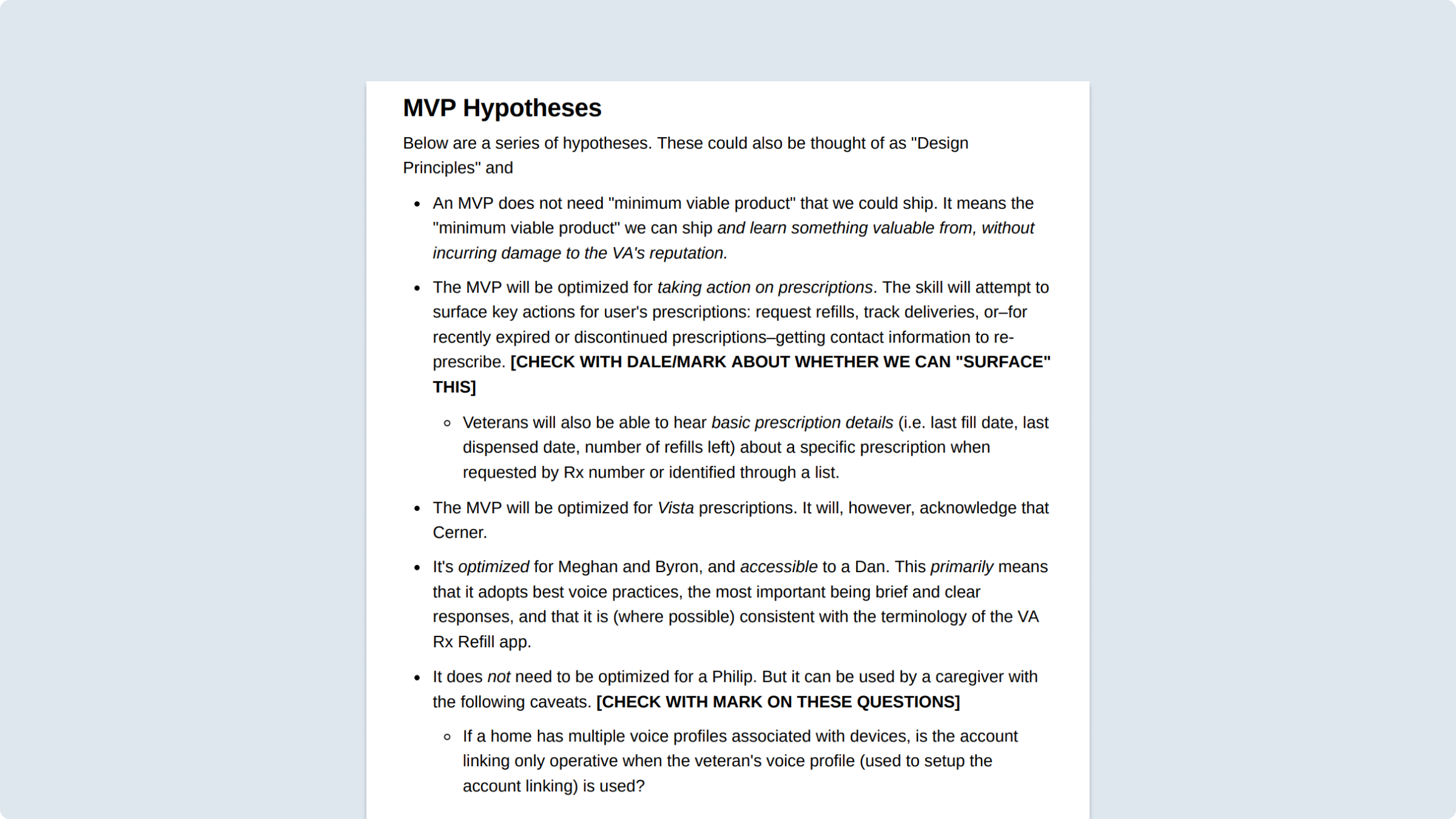
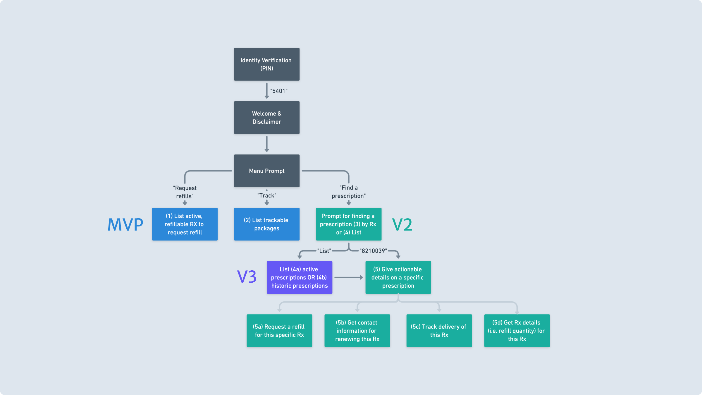
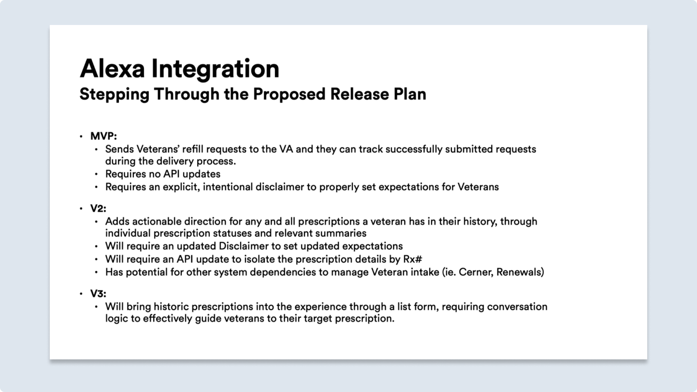
From this, we decided to focus on a small list of features for the MVP. Along with the basic mechanic of refilling eligible prescriptions, we also wanted to allow veterans to list all their prescriptions (whether they could refill them or not) and track shipments.
Communicating Design
Persuading client stakeholders regarding patient safety and best practices with voice interface design
Within the organization, we had several stakeholders who were extremely skeptical of the overall project. Would veterans care about this? Would this be safe for veterans to use? Would Amazon have access to sensitive healthcare data? Could other hack into the system and abuse it? Along with these concerns, many stakeholders had strong opinions on how feature-rich the device should be, opinions that frequently went against best practices for voice-first interface design.
For example, early on, some stakeholders had the idea that veterans would request refills one-at-a-time, speaking aloud the prescription number of the pill bottle they wanted to refill. We hypothesized that few veterans would want to be tethered to their prescription bottle. After all, how is the voice app making a leap in accessibility if veterans have to read tiny print on a bottle to use the application?
But early thinking about the API indicated we might have to do this, so I drew up storyboards to help our team align on the context.
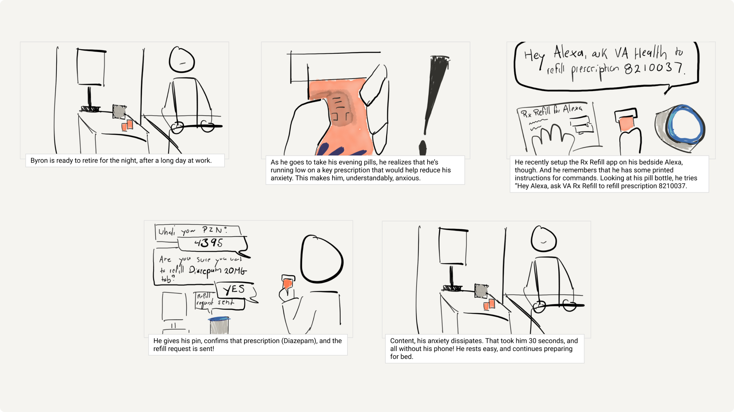
As conversations progressed, we realized the API was more potent than we’d thought—we would be able to list our prescriptions. So we moved to persuade stakeholders by showing different versions and feature sets we could move forward with.
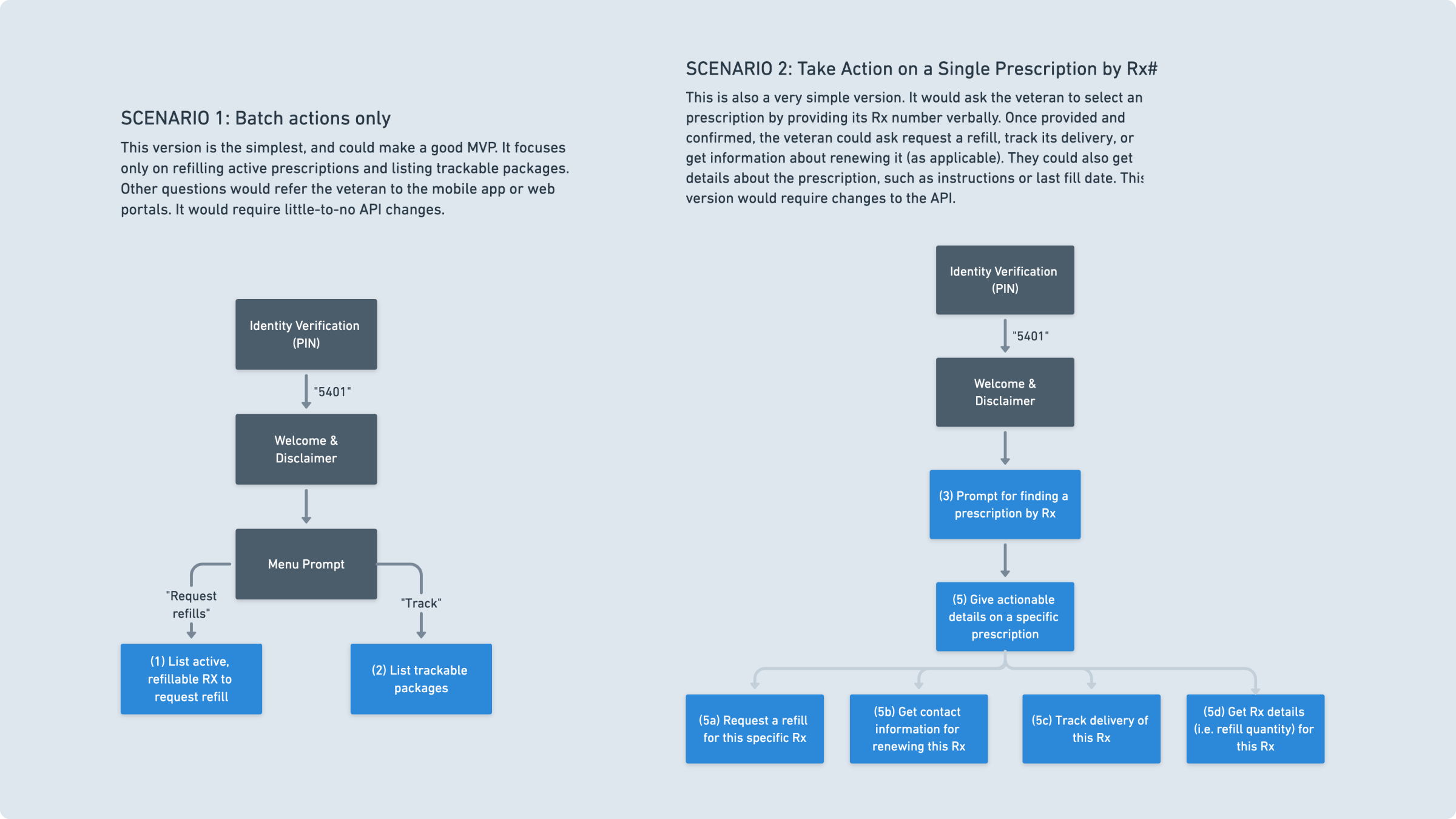
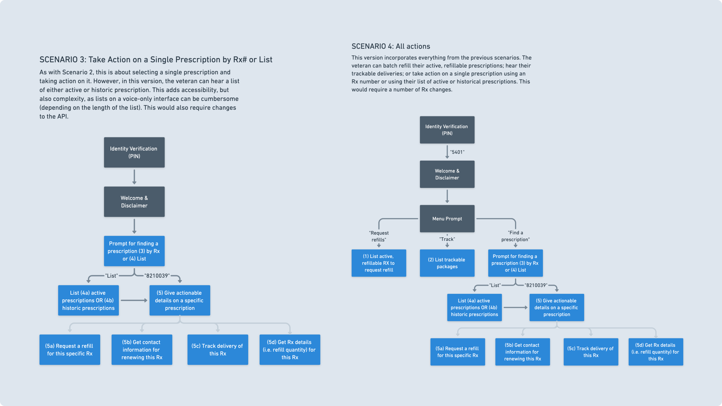
We were excited to move forward, but several client stakeholders were still very concerned around patient safety. Some stakeholders drew a line between patient safety and feature parity, convinced that the voice application had to have all the features of the mobile or web interfaces. We went back-and-forth, until we realized this—that they didn’t see how a feature-light “MVP” could meet patient safety standards.
Our team’s PM and I worked together to establish a roadmap schedule, assuring all involved that for our purposes, “MVP” meant the simplest version of the app we could test with—we wouldn’t release the larger voice app until we had all features built. Though some elements of this plan felt unnecessary to us internally, it reassured stakeholders, allowing us to move forward.
Information Architecture / Content Strategy
Preparing to prototypew with scriptwriting, aural wireframes, and outlining a language model
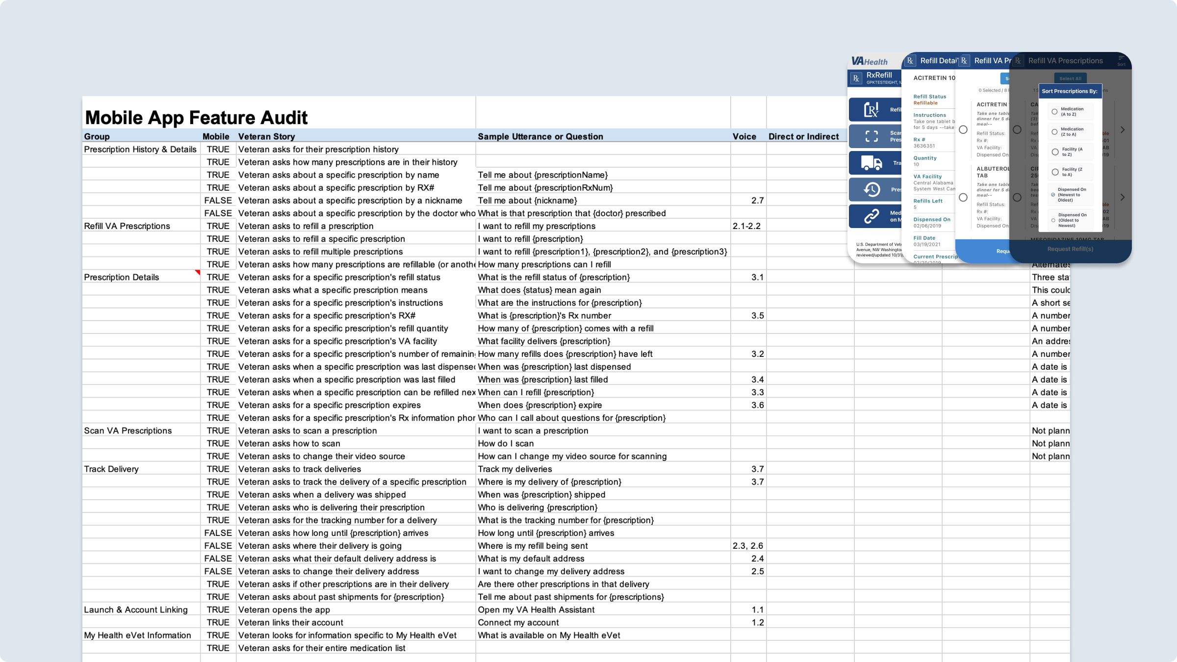
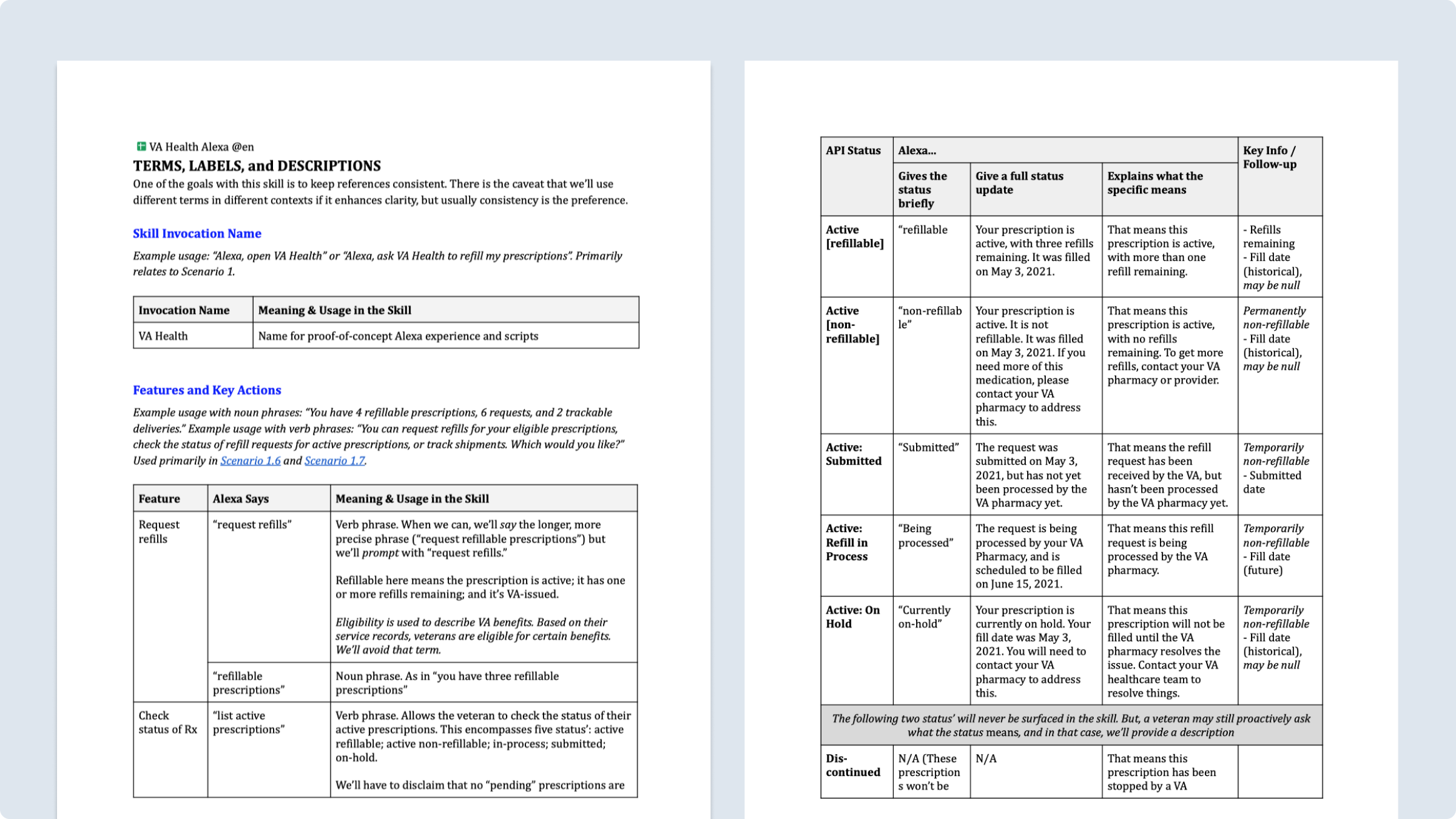
We had finally gotten sufficient buy-in on our designs to move forward with testing. To test, however, we had to have a fairly robust prototype. To prepare, I outlined a voice and tone for the product, and wrote copy for all standard and edge use cases. In total, this resulted in a 50-page document outlining all copy and wording that would be used in the voice application.
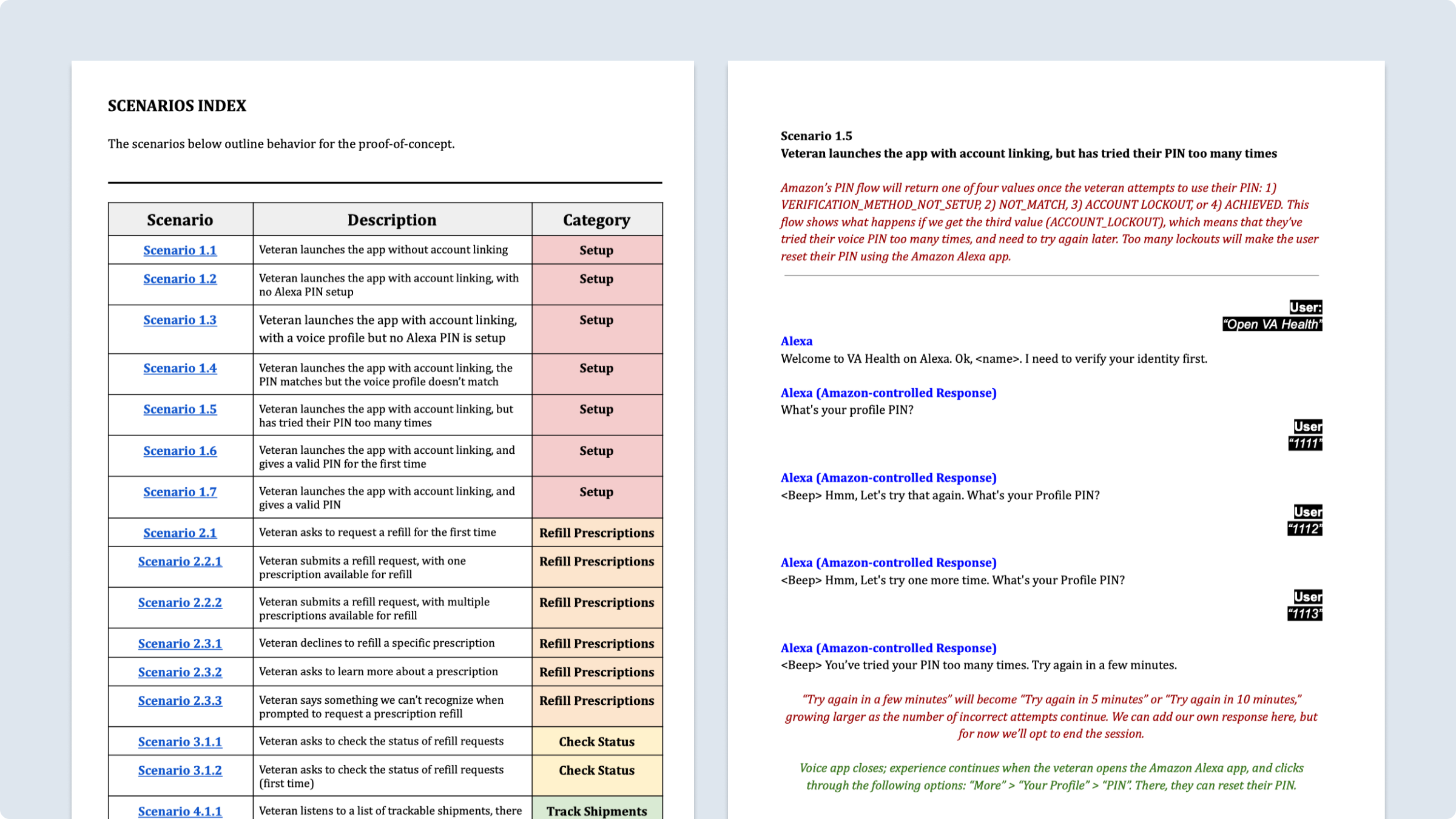
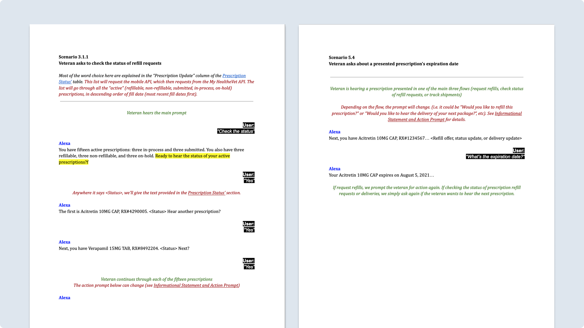
Each of these scripts paired with an “aural” (or audio) wireframe. Unlike visual wireframes, which can be represented statically in space, voice interfaces are experienced temporally, in time. So while a script is helpful, it is not a “full representation” of what the experience would be like. Hence, we composed aural wireframes for key flows.
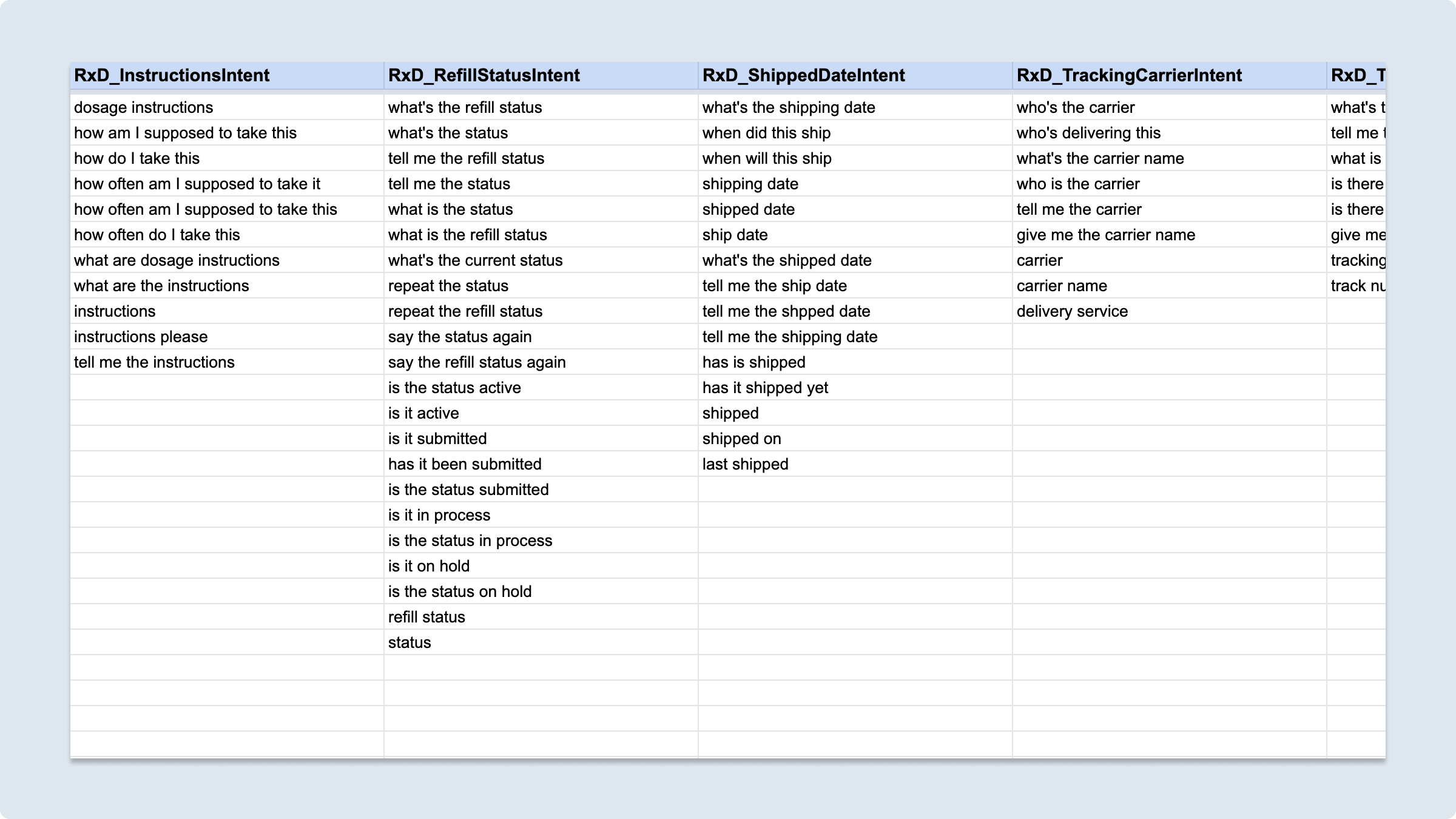
Working from these scripts was a major exercise in designing the information architecture of the skill. We identified 52 intents—52 things a veteran might want from this skill—and matching utterances. For every intent, like asking for dosage instructions, there were many ways a veteran might express that. “How am I supposed to take this?” “How do I take this?” and “What are the dosage instructions?” We wrote intents and utterances for each of the questions we could anticipate.
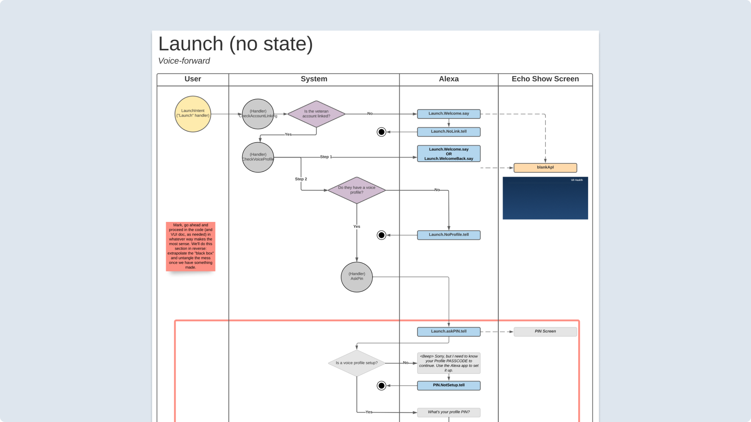
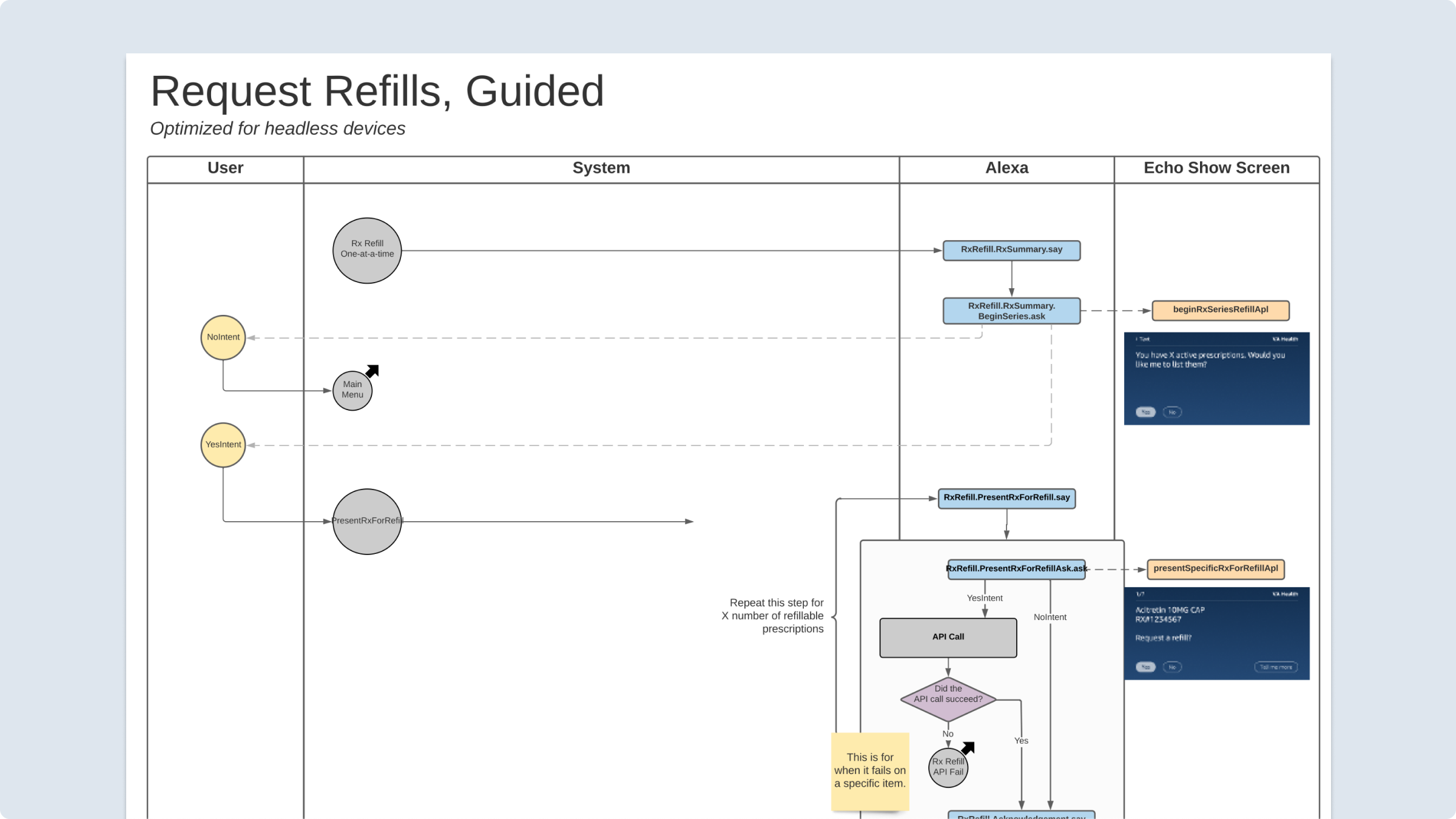
Parallel to this activity, I also drew up detailed plans of how the voice UI would work for engineers to work from. Internally, we referred to these as “State Machine Diagrams.” Several of them took the form of multimodal swimlanes. Each of these blueprints acted as a key handoff document, outlining states, edge cases, and where every response fit into the big picture of the design.
Designing Visuals with Voice
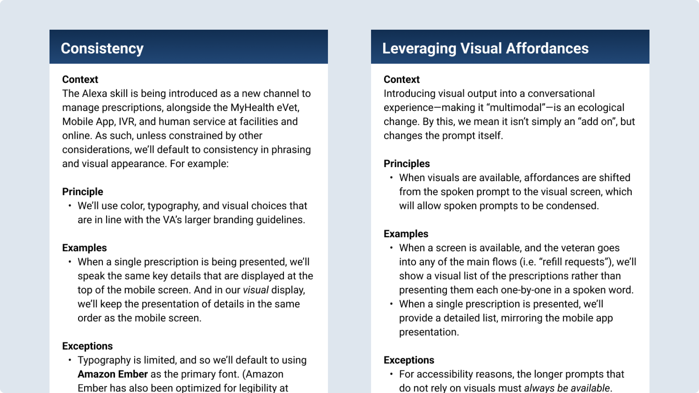
Outlining design principles for how visuals and voice would interact
Among those who own smart speakers, 25% owned at least one device with a screen or display (as of 2021). As such, we had to consider how the interactions would change when a visual display, and the opportunities for affordances that came with it, would change the prompts.
The first thing I did was establish some simple baseline principles of how visuals and voice would interact.
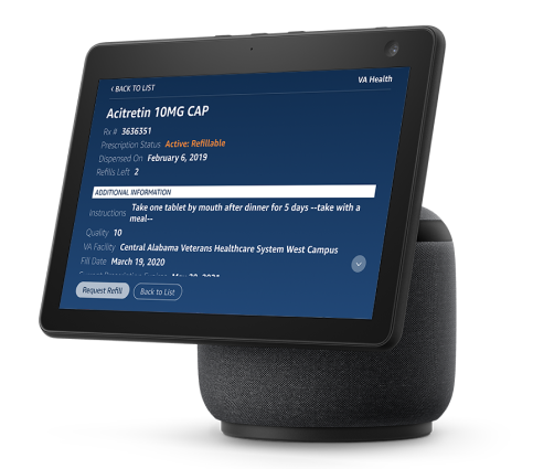
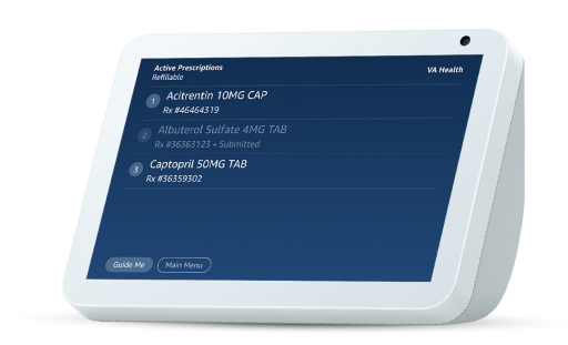
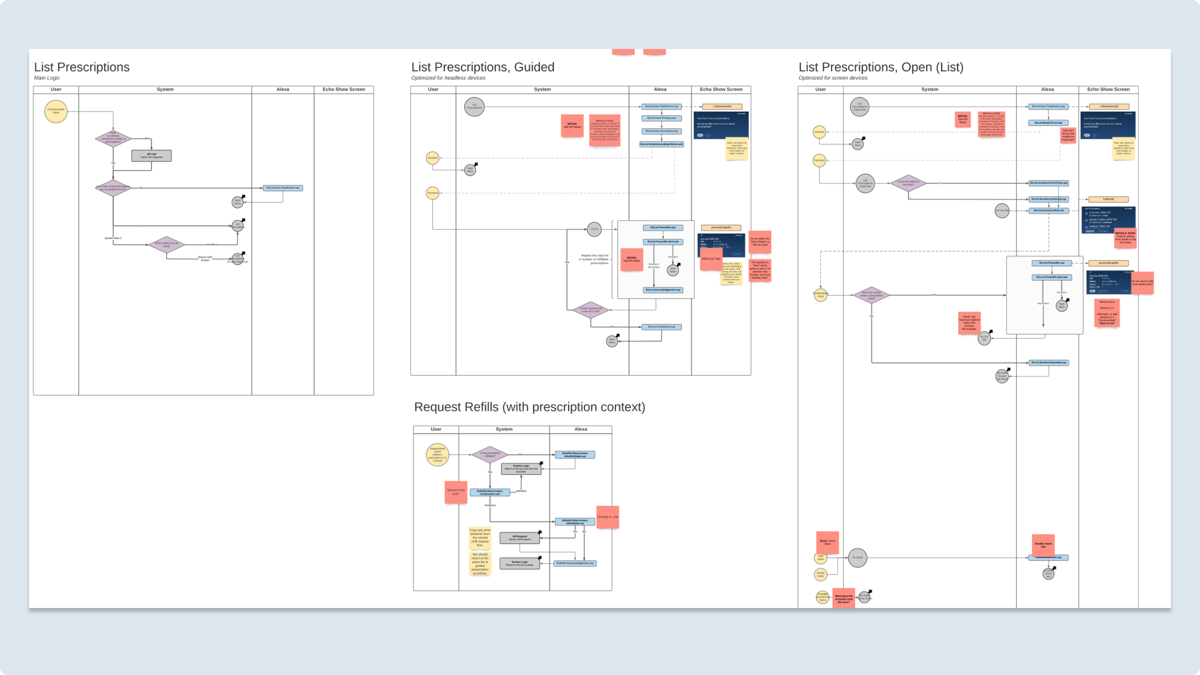
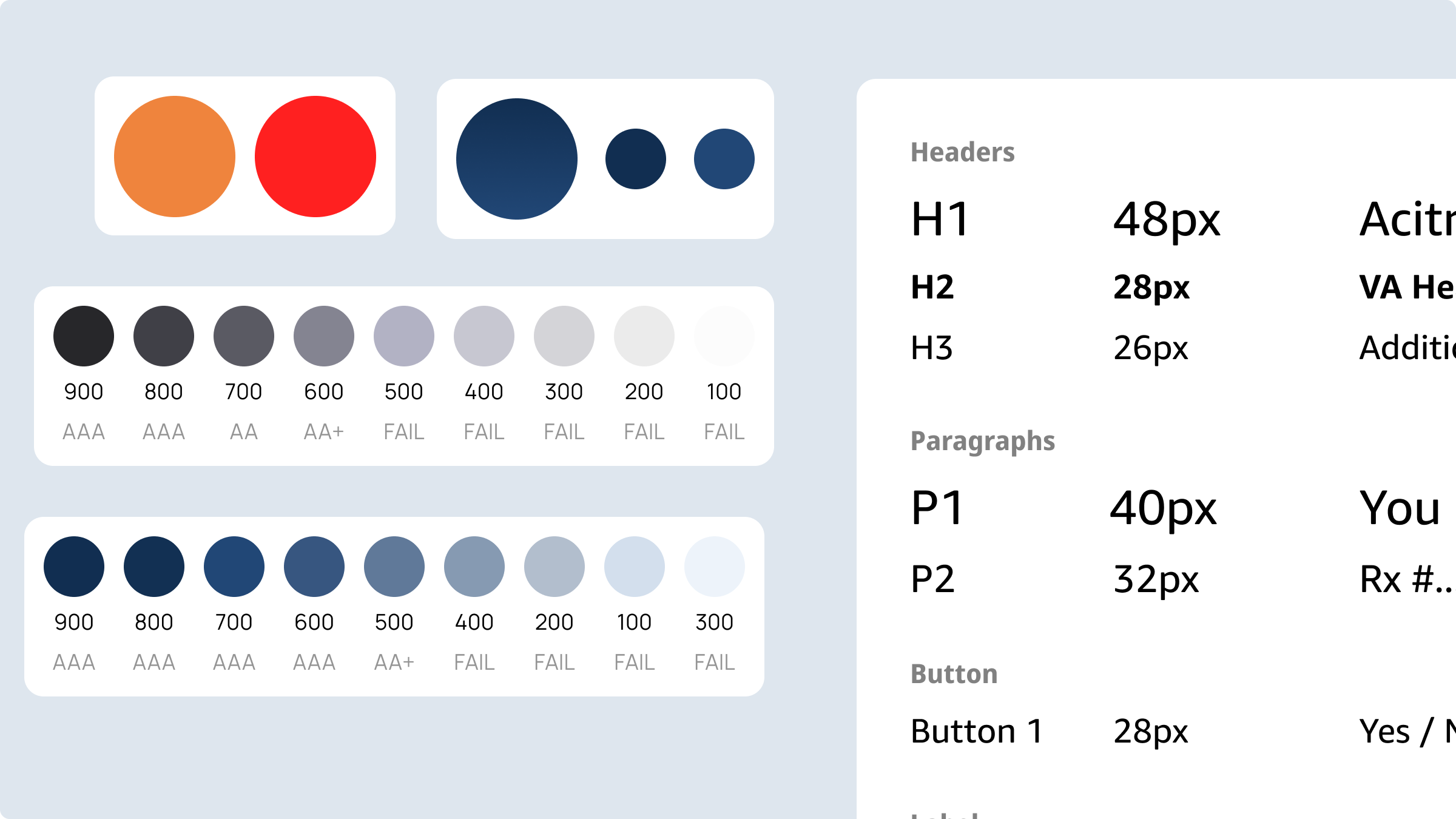
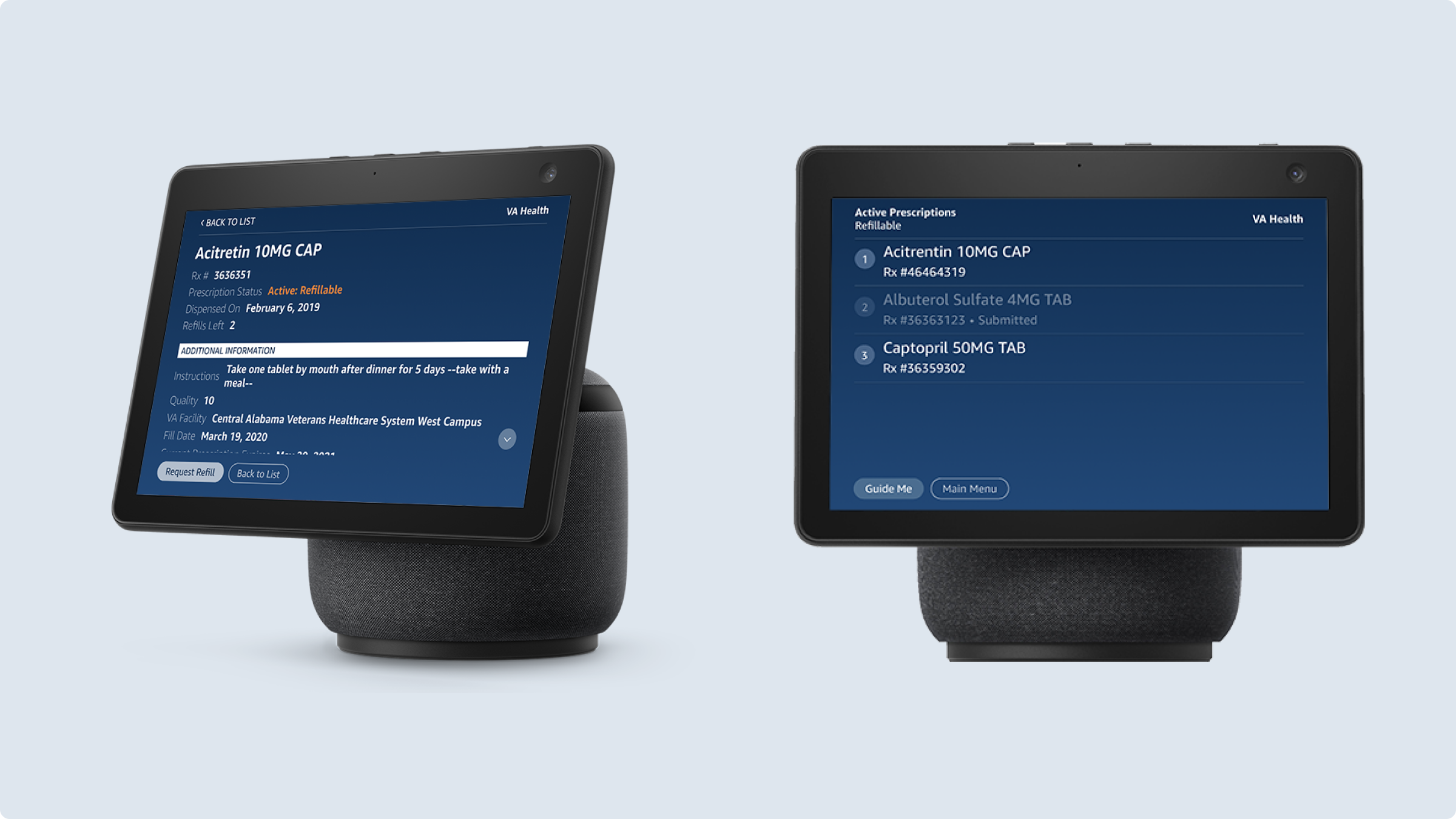
The constraints around visual design for Alexa smart displays are quite strong. At the time of design, there were only a few potential dimensions for screens, and Amazon had invented its own display language, APL (Alexa Presentation Language), instead of using HTML and CSS. Within these constraints, I made a very lightweight design system drawing within Figma, outlining what each of the screens would show.
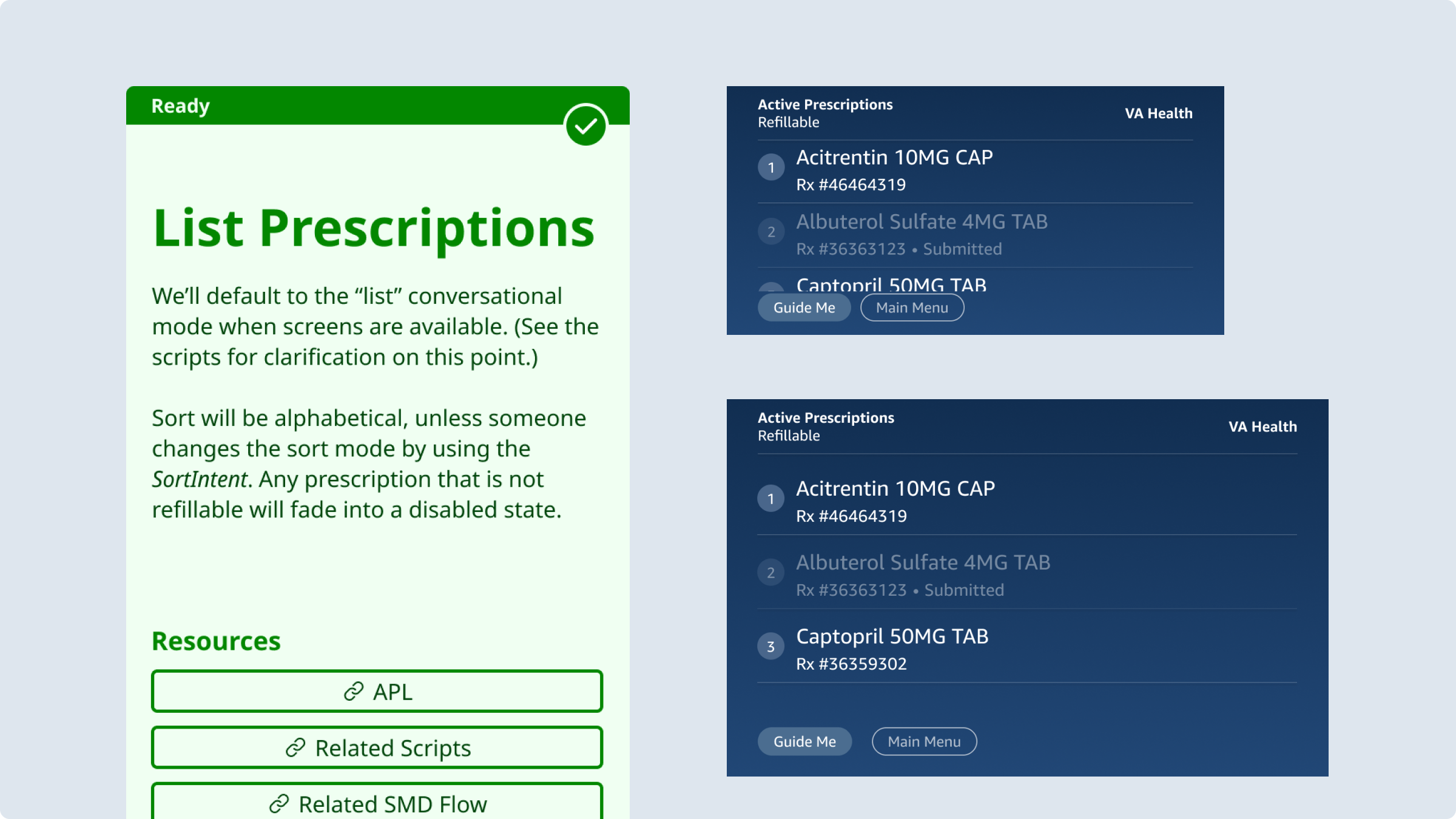
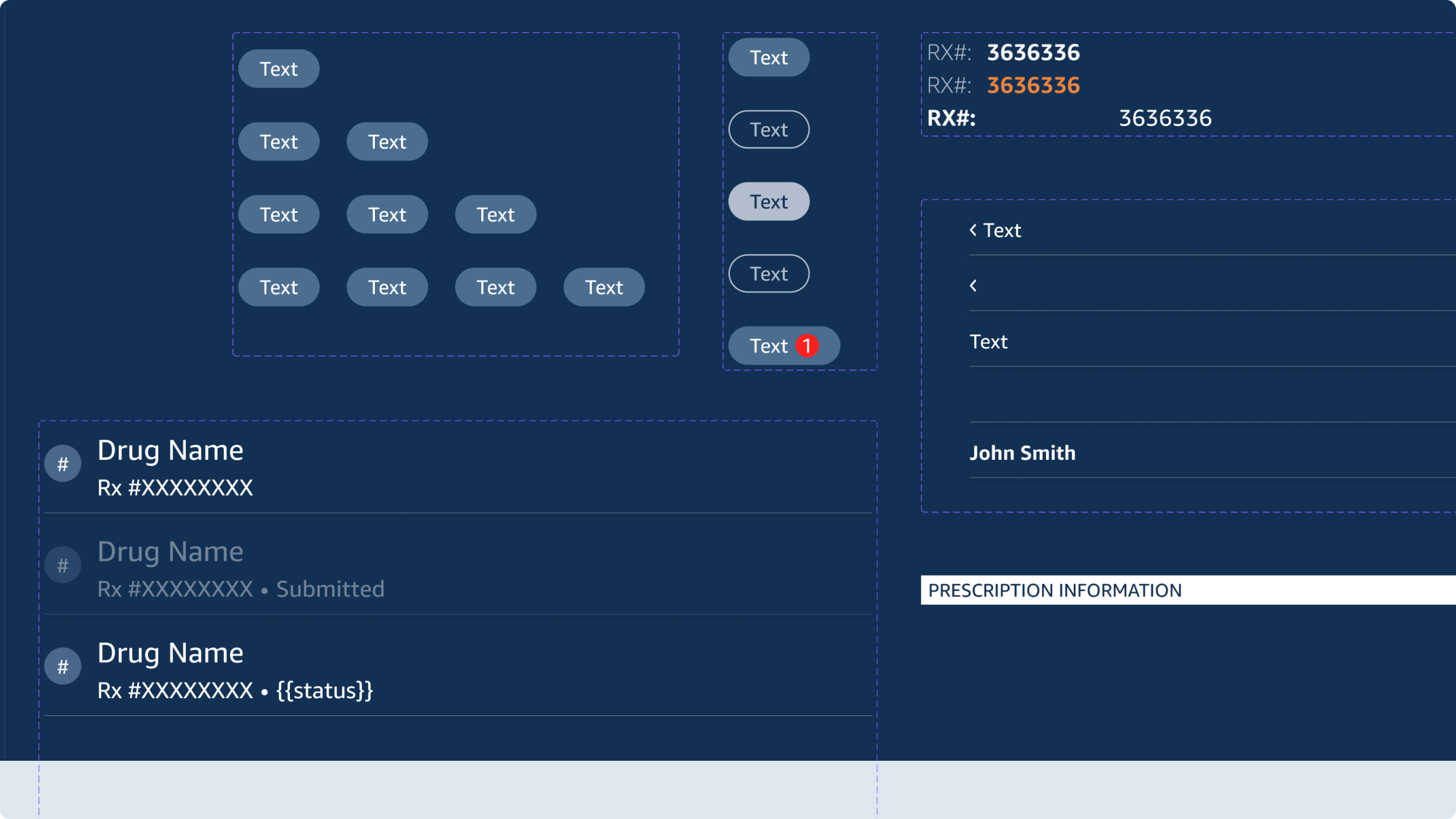
With these screens in place, I was able to add in key details about how the visual display would work alongside the voice prompts. I captured these details in multimodal swimlanes, outlining how voice inputs, system logic, visual output, and voice outputs would work together.
Finally, it all came together in a working prototype with screen support.
Moderated / Unmoderated Usability Testing
Learning how veterans refill prescriptions through moderated usability testing
We were finally ready to test. The focus was on moderated usability testing we would conduct at a VA facility in Virginia. We would have 8 participants, most of whom had some kind of disability (low vision being the most common). Eight participants wasn’t enough to give us statistically significant results, but it would help us catch major errors and de-risk the major flows.
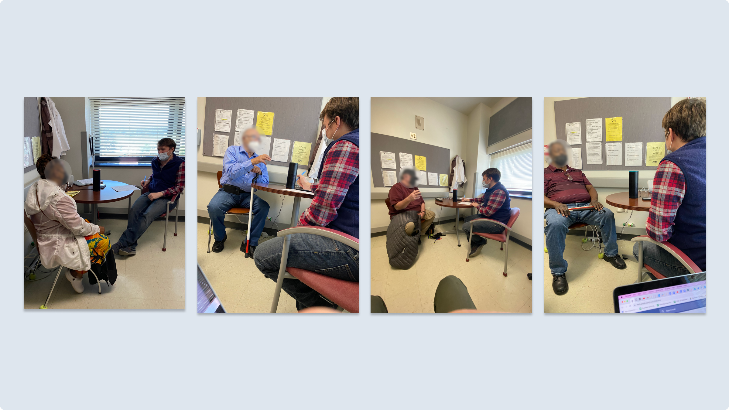
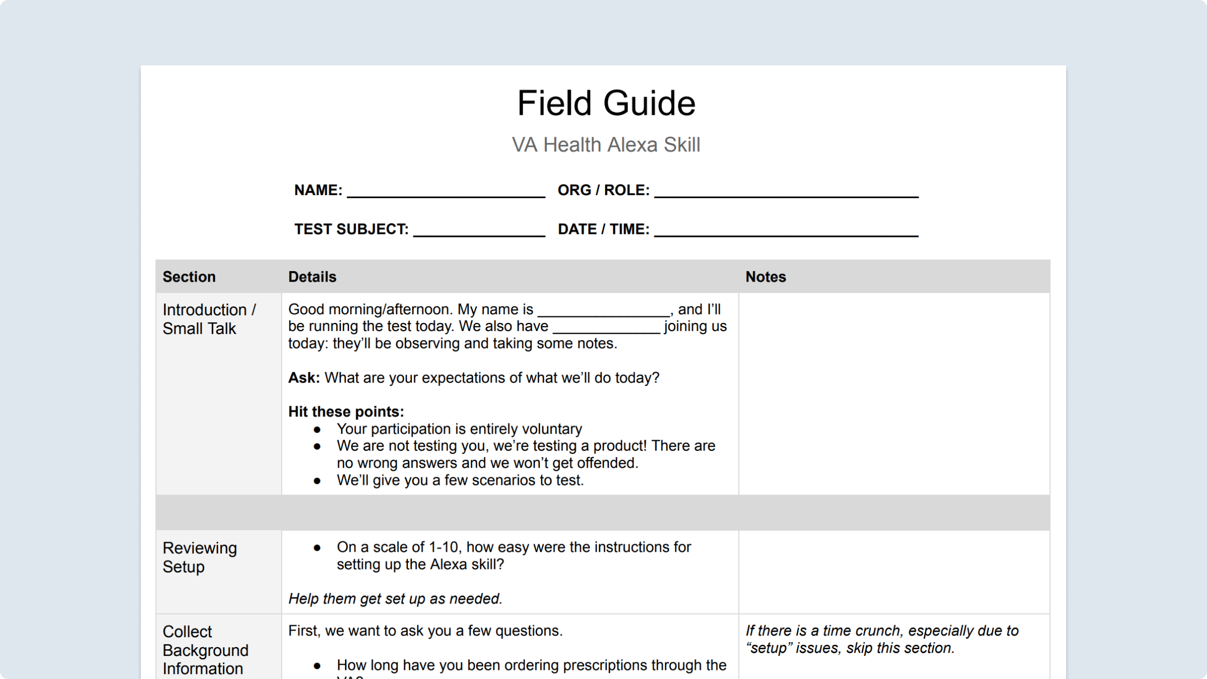
I led the design of the test and recruitment. I helped select screening criteria, send out pre-testing emails, and prepare test objectives and a field guide. And I conducted the interviews.
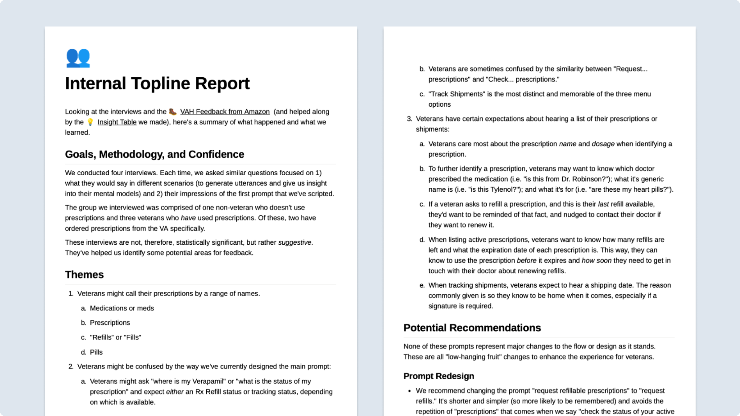
Testing went really well. Overall feedback was really positive, validating several of our hypotheses. Of course, we also had several of our assumptions challenged. Most of our revisions had to do with clarity of language (i.e. such as the difference between “request prescriptions” and “check prescriptions,” which were two different features in our flow). We also learned that we needed to surface some details proactively, such as the number of refills remaining. (In our effort to be brief, we had excised this detail.) In all, I compiled our insight into a four-page topline research report.
All signs suggested that our early discovery efforts—drawing on personas, subject matter experts, stakeholder interviews, and audits of the existing ecosystem—were done well. The results visibly excited our team and our client, even the most skeptical members of the team.
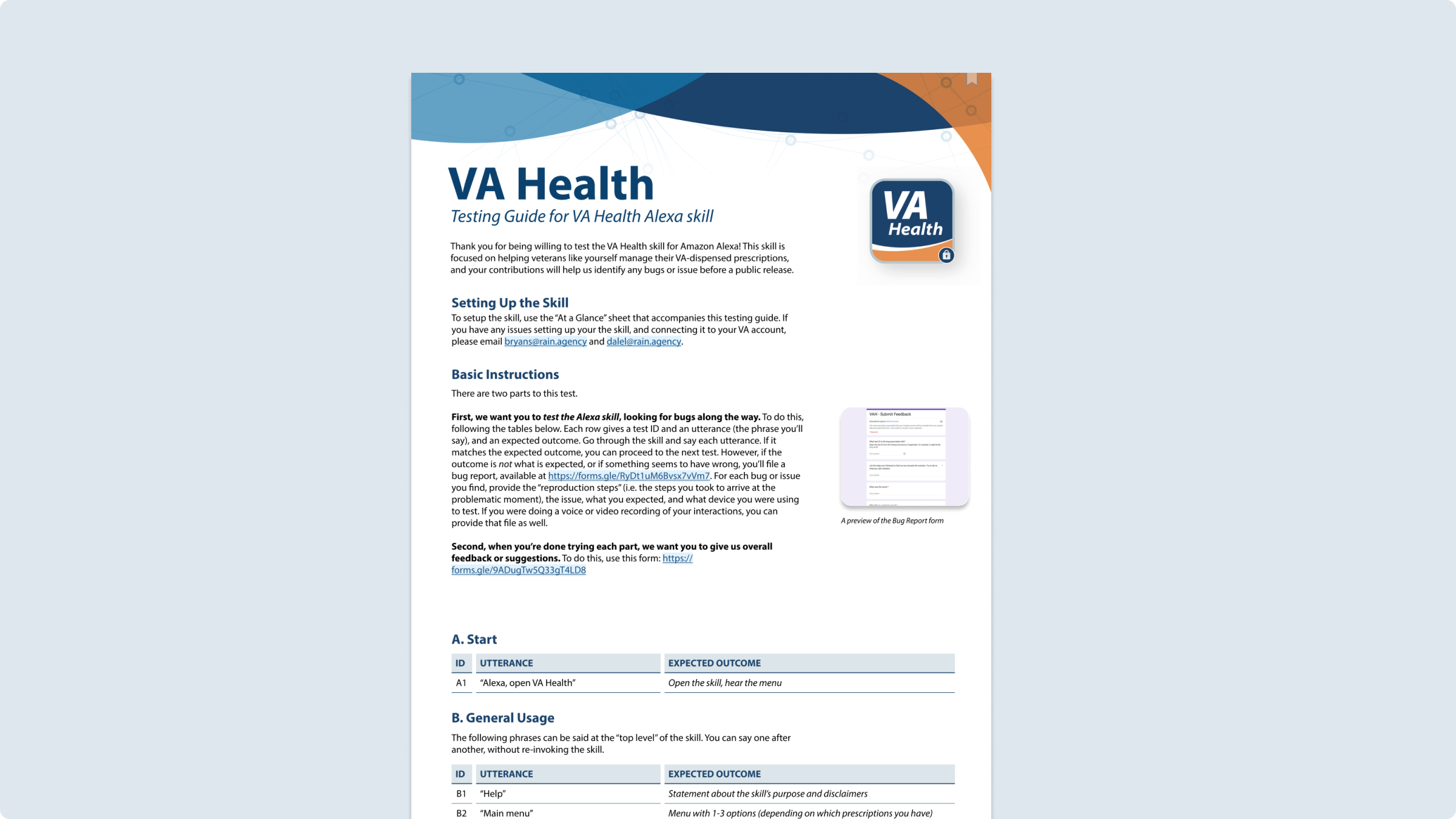
The only thing remaining for our MVP to start a soft-launch was QA testing. I prepared a testing guide for our QA team to use.
Being Mugged by Reality
Amazon pulls the plug on consumer-facing medical voice apps just as we prepare for a soft launch
Unfortunately, we faced a swift disappointment at the projects end. Just as UAT was about to begin, and as we were preparing to “soft launch” the Alexa voice app among family and friends, Amazon announced layoffs in departments associated with Amazon Alexa.
In the wake of these layoffs, we learned that Amazon had dropped support for HIPPA compliant skills. (HIPPA laws are a series of regularly standard that outline the lawful disclosure of protected health information in the United States.) Without this support, the project, as we had envisioned it, was terminated. There was no way to launch a consumer-facing voice application for Alexa that dealt with medically-sensitive information.
So how do you measure success on a long project like this—that never shipped? Because the product never shipped, we never had access to statistically significant data—like conversion rates, total prescriptions refilled over this channel, total time spent on the product, and qualitative reviews. As a self-respecting UX designer, I keenly felt the loss of this kind of data.
But based on the original charge, we had some early pointers that both accessibility and time-on-task had improved.
400%
Improvement in task-on-time compared to the IVR flow; time to refill could be as short as 30 seconds
And we had some success within the organizational environment, as well.
-
Convincing skeptical stakeholders. We managed to convince some very skeptical stakeholders that a natural-language, conversational interface—if executed well—would be valued by veterans, especially those with disabilities (e.g. low vision). The topline research reports and quotes from our interviews visibly excited these stakeholders, and excitement shouldn’t be discounted. Nor should the power of user research to be the most potent persuasion tool in product design. That research was what tipped the stakeholders toward buy-in.
-
Paving the way for an integrated conversational AI product strategy. A consumer-facing Alexa voice application was never the endgame. This was always envisioned to pave the way to integrate voice inputs into the mobile app. In this modality, voice could work as a powerful input, and voice paired with visuals could work well as a powerful output. Although the Amazon Alexa chanel never worked out, conversations were being had about pivoting our work in this direction.